

Contour & TELUS
Crop Management integration
Client: Origin Digital | TELUS
Year: 2025
Role: Senior Product Designer
Links: Contour | TELUS | Telus Crop Management
Accessibility • UX/UI • App Design • UX Research
The mission
As a Senior Product Designer at Origin Digital, I was embedded into the TELUS Crop Management integration piece, and led the design efforts.This included establishing account level connections, designing field matching and management flows, and contributing to ongoing data synchronisation work for ~20,000 growers, supporting precision-agronomy workflows across 700K+ hectares.
The big picture of integration
TELUS is a large Canadian tech company best known for telecom, while also building digital tools for healthcare and agriculture. The TELUS Crop Management product focuses on farm management an helps farmers to plan, track, and analyse data. Origin’s Contour, is precision agriculture software focused on field boundaries, guidance lines, and data cleanup to improve accuracy in farm operations.
By integrating these two systems (TCM/Contour) - we could:
Allow seamless field data synchronisation: Ensuring users across both platforms (Contour and TELUS Crop Management) always have up-to-date, accurate data.
For example, a grower (/agronomist or farmer) with accounts on both platforms, benefits from a seamless integration. By connecting these accounts, they can easily share data about their farm(s) without extra manual effort. This integration allowed users to manage and update their field data in real-time, improving workflow efficiency and reducing the risk of errors.
Simplify user workflows: This integration also eliminated the need for manual data reconciliation. Users can access all necessary farm data from one platform, streamlining tasks and reducing complexity.
Inform decisions: Real-time, consistent data enabled better decisions in crop management and planning. Users can quickly compare and act on the latest data from both platforms, improving field management efficiency.
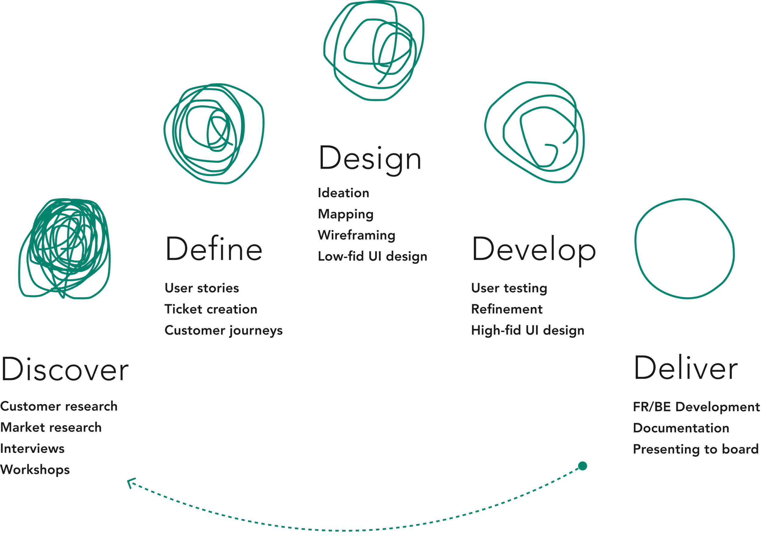
The process
By utilising the proven 5D product framework, the team went through a continuous cycle of iterative improvement, refinement, and implementation for this piece.
This approach ensured that we consistently delivered high-quality and user-centric solutions by focusing on key stages: Define, Discover, Design, Develop, and Deliver. Each phase built upon the previous one, allowing us to adapt quickly based on user feedback and data.
By maintaining a cycle of continuous iteration, we were able to refine designs, enhance usability, and ensure that the integration aligned perfectly with user needs and business goals for Origin Digital and TELUS.
We conducted interviews to understand requirements
-
"What signals help you understand that two products are connected and working together (e.g. confirmations, synced updates)?"
-
"What data needs to be shared between products to support your workflows, and which gaps or inconsistencies cause the most friction?"
-
"Which tasks require you to move between products, and where does that handoff currently break down or feel inefficient?"
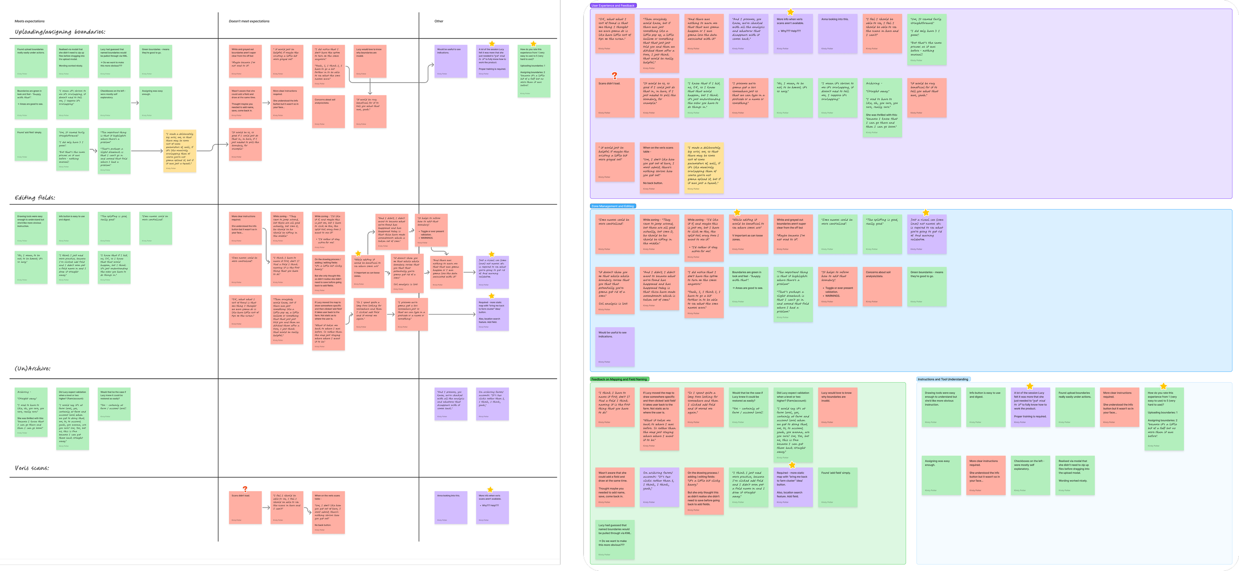
Research analysis
Through open-ended, task-focused interviews, I identified key patterns in user behavior and needs, which were then transformed into actionable insights.
I also explored the TELUS Crop Management platform in great depth, and collaborated with TELUS's engineering and product teams to gather additional insights on implementation.
Business goals and KPI’s were central in guiding the direction of the project.
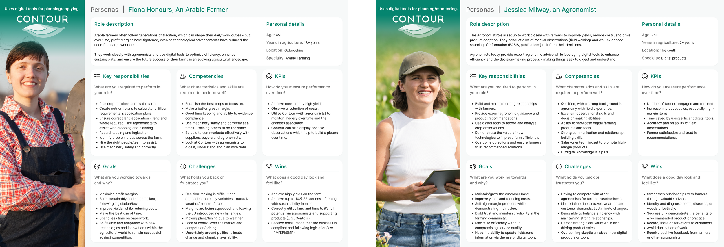
Personae
I created personas to capture user needs and behaviours, informing design
decisions and guiding feature prioritisation. This helped us to define the roadmap phases.
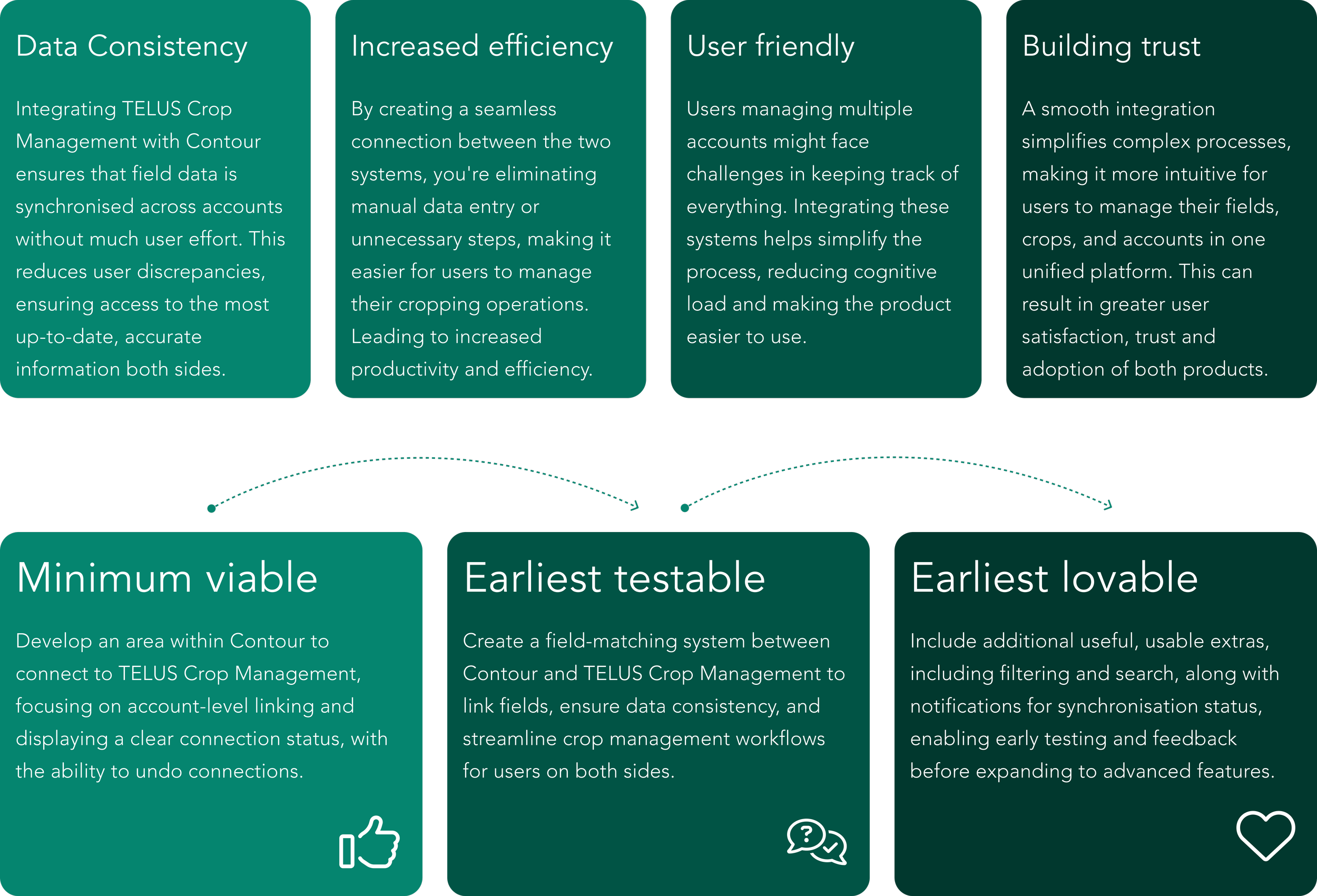
Key opportunities
Through thorough analysis of the user research, I created clear themes that directly informed design decisions and product direction.
Roadmap phases
We followed a phased roadmap showing the evolution from core functionality to a polished, user-friendly experience.
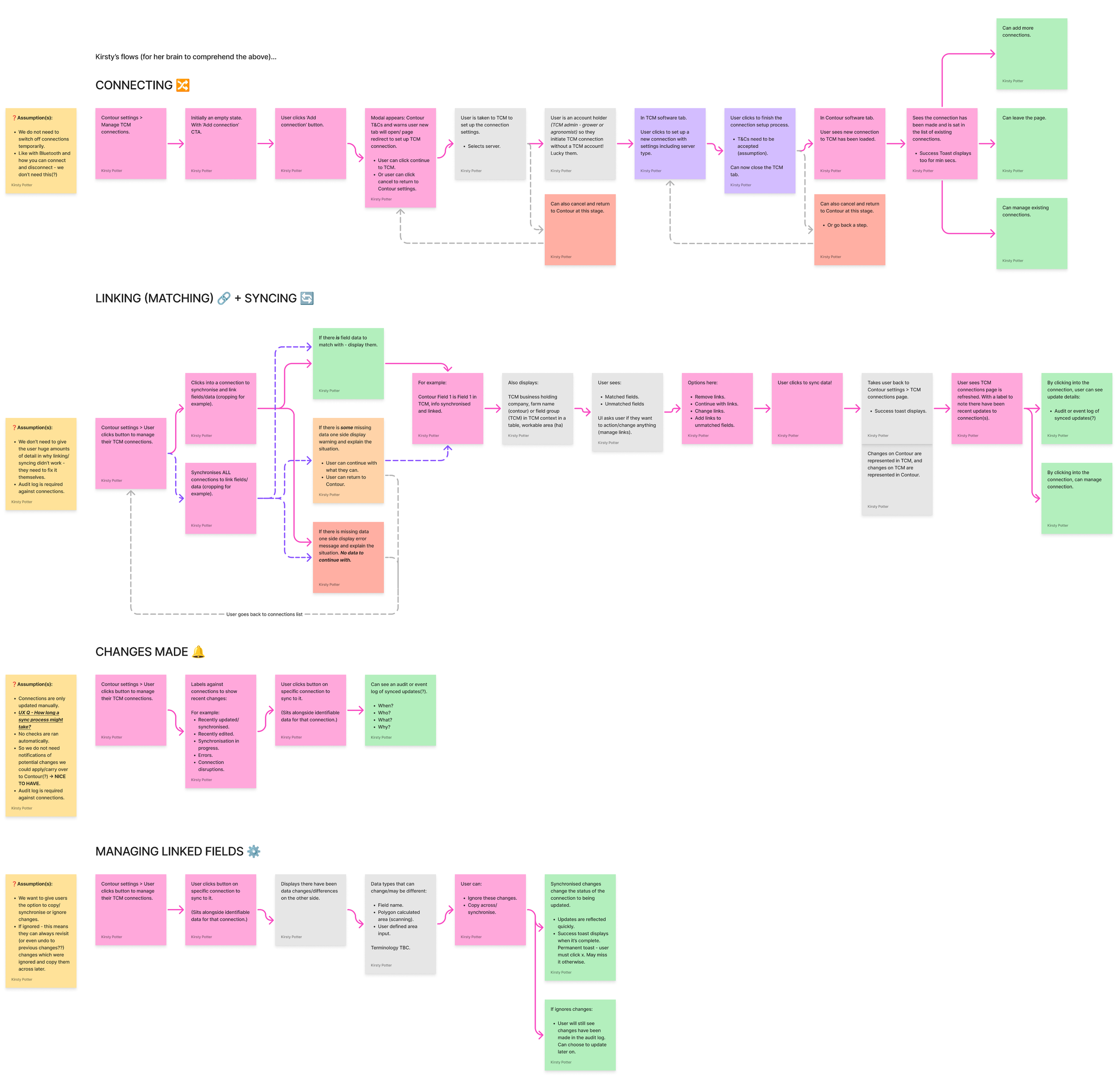
Connect, link and sync flows
Mapping early user journeys helped to visualise key workflows, identify pain points, and uncover opportunities for improvement.
Connecting accounts must be easy: To simplify the connection process, we introduced unique codes, generated on the TELUS side - allowing users to link accounts effortlessly without complex steps or confusion. With helpful pointers and onboarding, users connect quickly and easily.
Disconnecting should also be easy: Users need full control of their accounts, so it was key to provide clear visual cues indicating which accounts were linked, plus the ability to remove them.
Field matching and unmatching must be seamless: We wanted to ensure that users could quickly and accurately align fields between systems without unnecessary friction.
Synchronisation should be fast and easy, with notifications: Still a work in progress, the team is focused on making synchronisation quick and user-friendly, with real-time notifications on both platforms about changes, errors, and updates to keep users informed every step of the way.
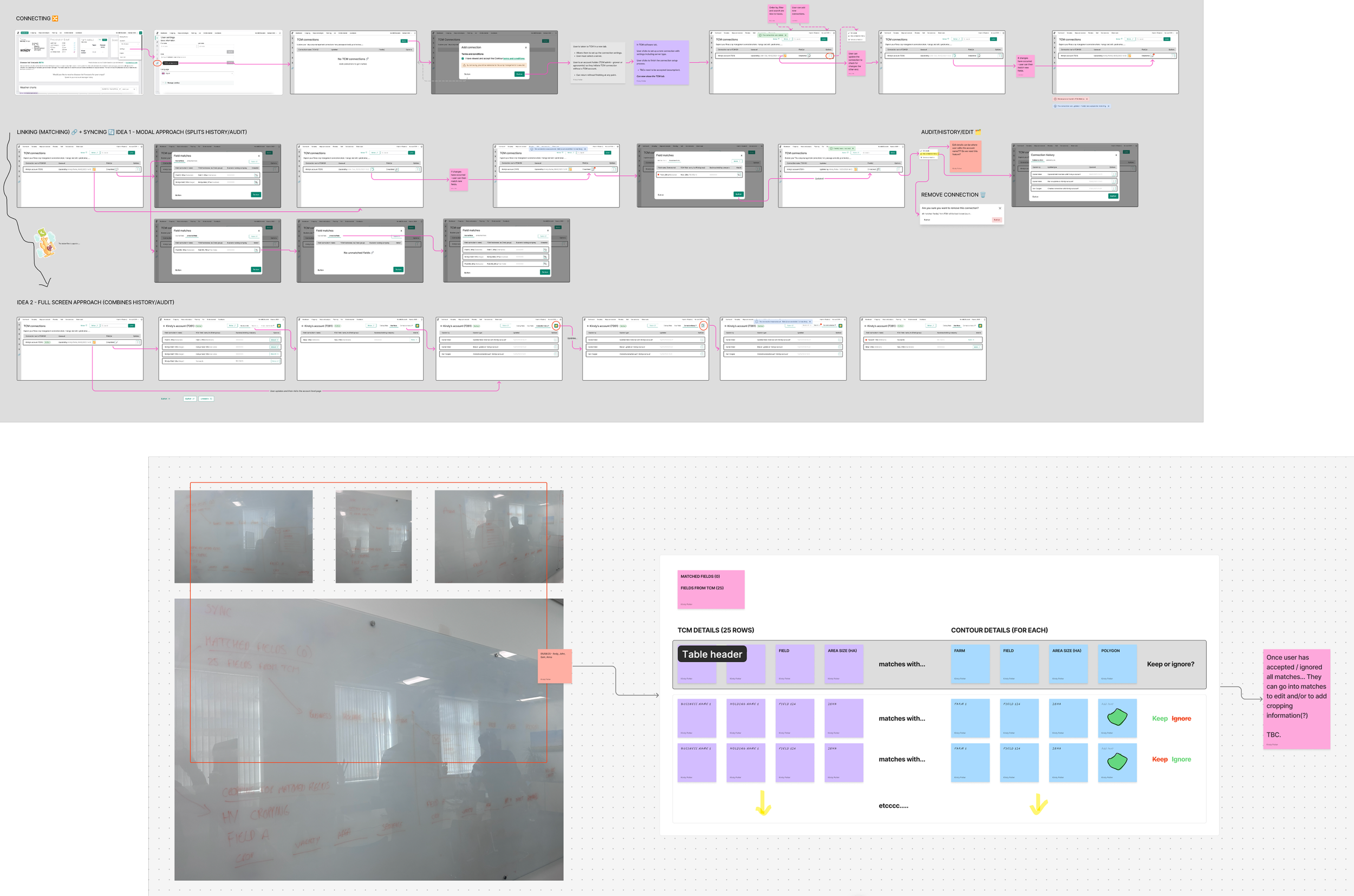
Wireframing / low-fidelity mock ups
I explored low-fidelity wireframes to map out core interactions and test early-stage design concepts.
This allowed me to quickly iterate on key features like account connections, field matching, and synchronisation, ensuring they aligned with user needs and business objectives.
The low-fi approach helped streamline feedback, workshop and refine these interactions before moving into higher-fidelity designs.
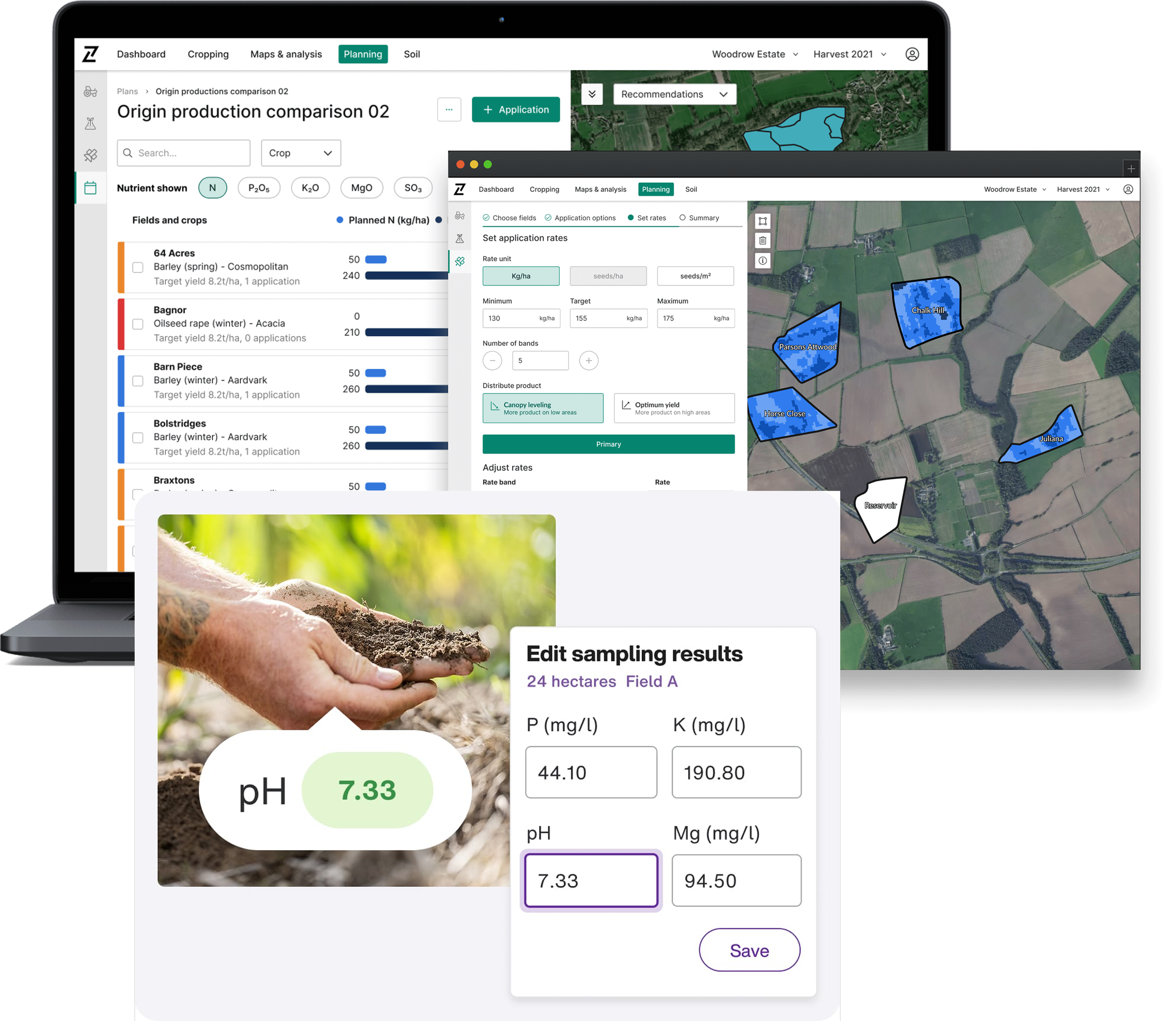
The results
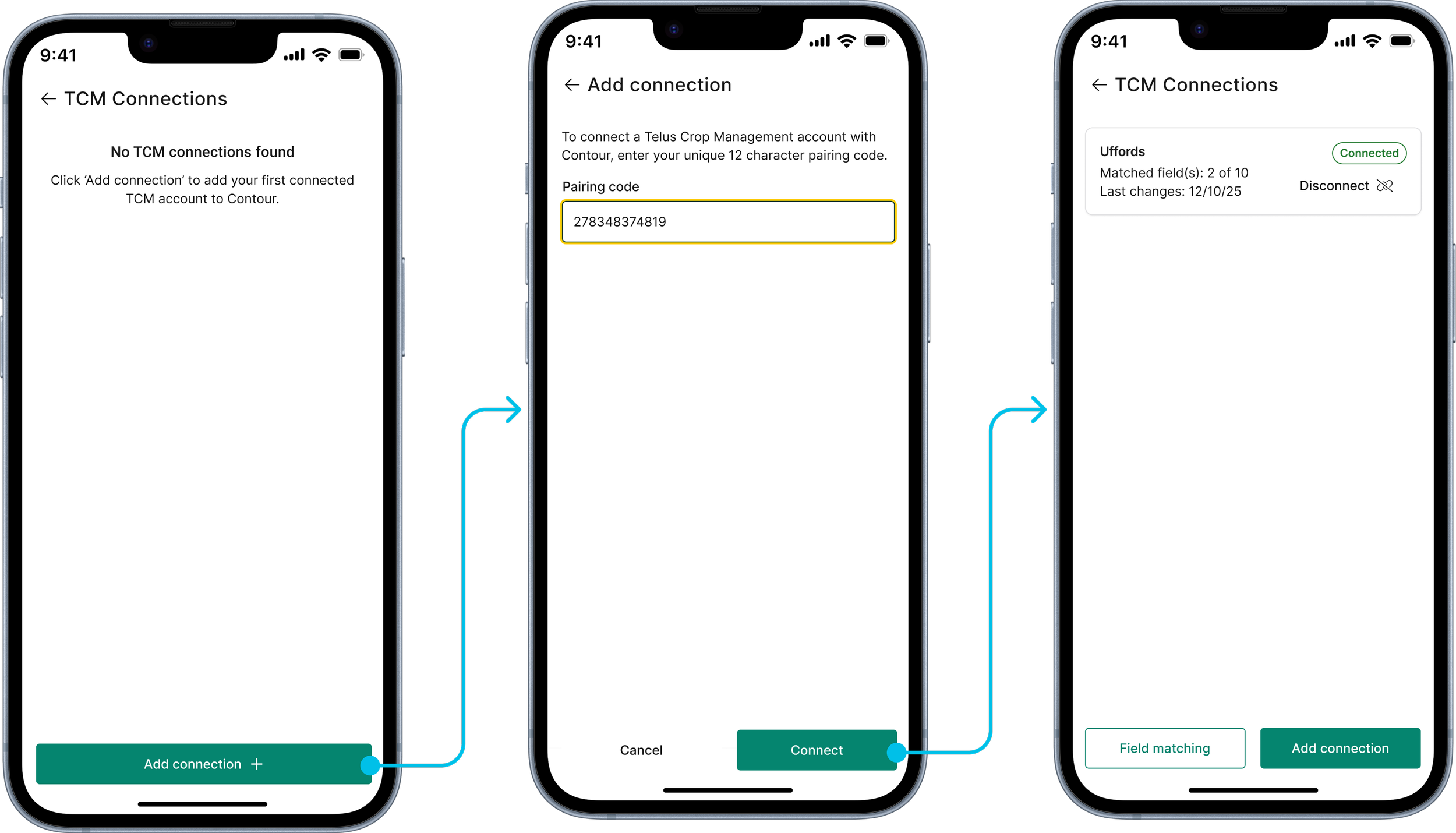
Connecting to TELUS Crop Management
For the mobile version, I focused on creating a streamlined, touch-friendly design that made connecting accounts quick and intuitive, ensuring minimal steps for users on smaller screens. Users were onboarded before they inputted codes, so they knew how to obtain them.
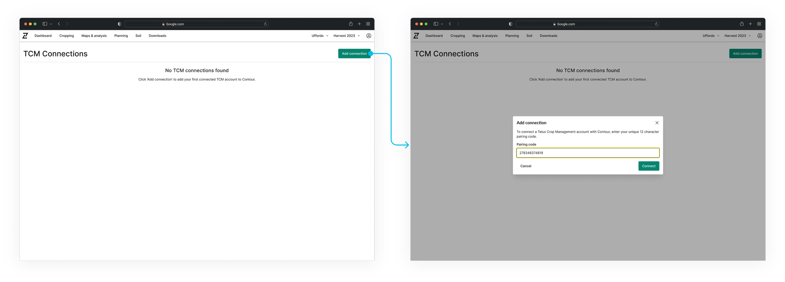
For the desktop version, I expanded the layout to take advantage of the larger screen, providing a more detailed view of account connections and allowing for easier navigation between linked accounts.
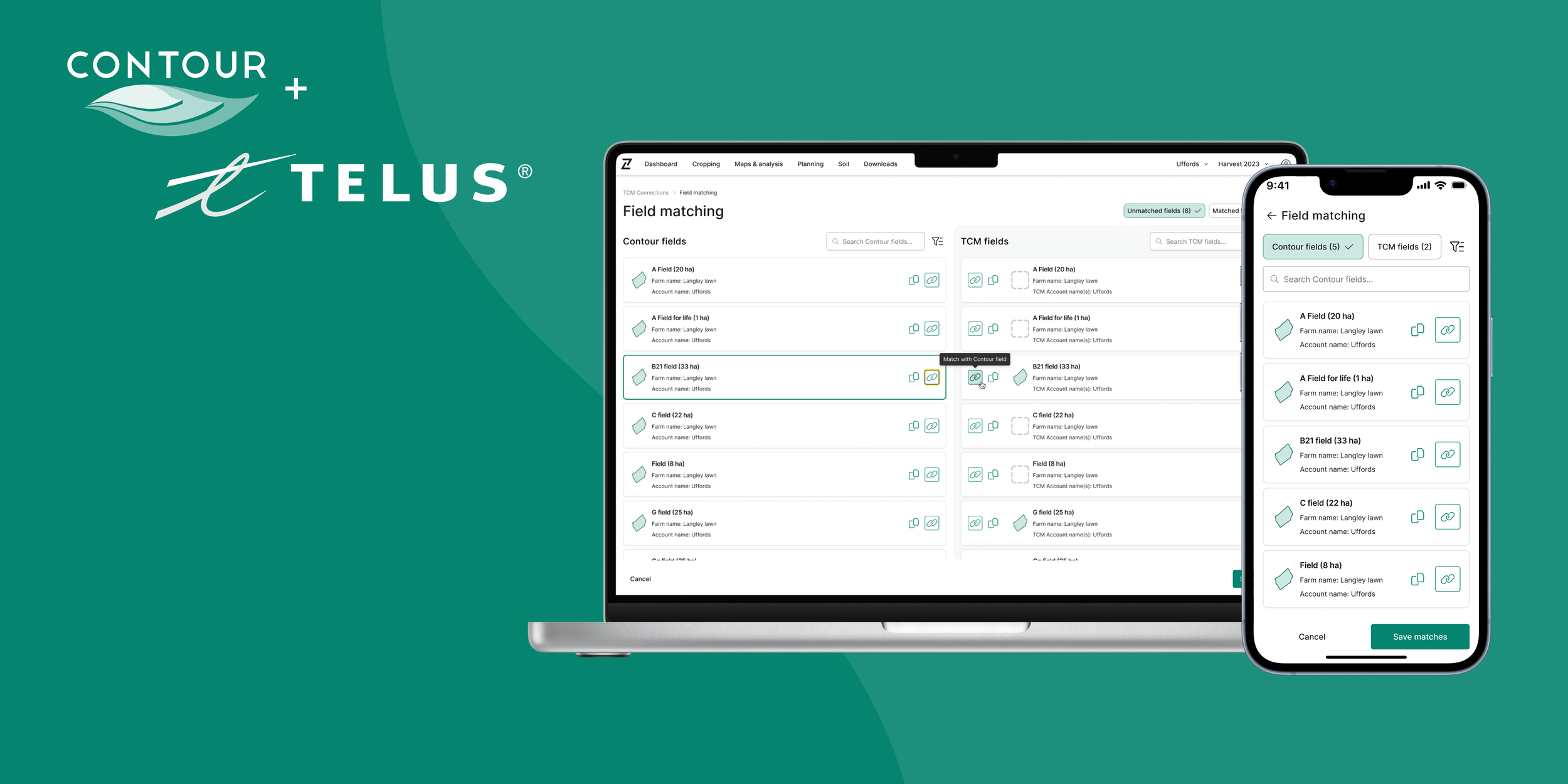
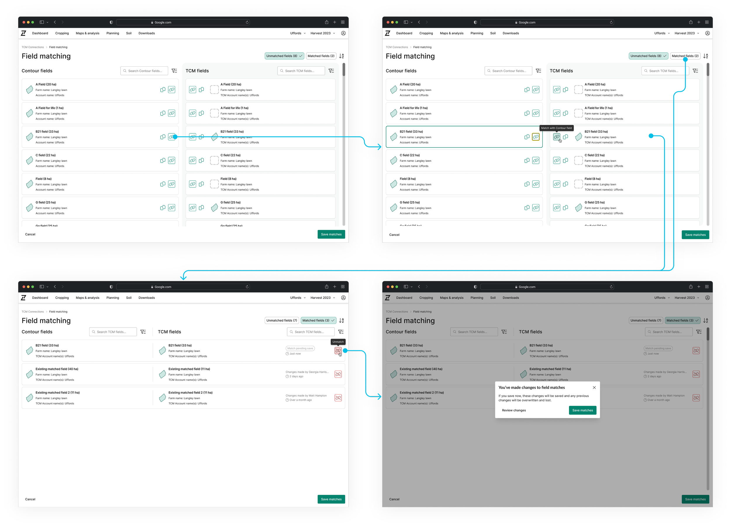
Field matching / unmatching
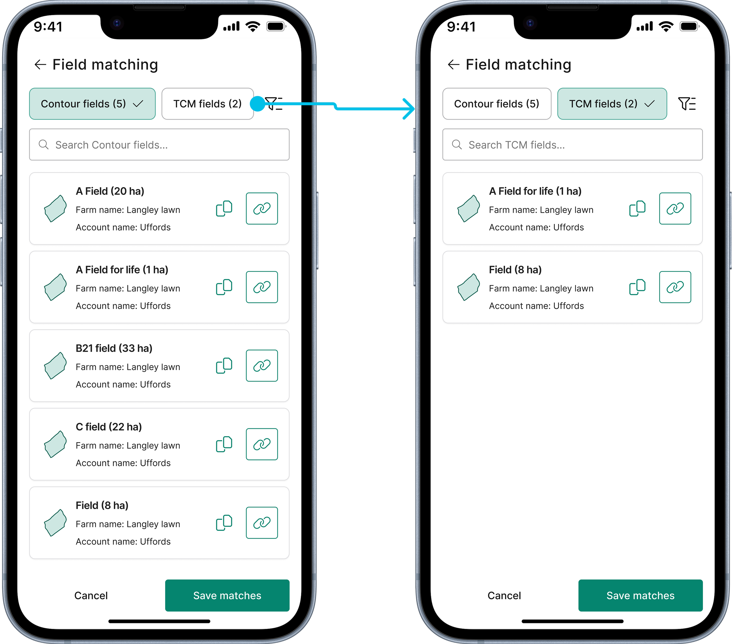
For the mobile version, I designed a clean and accessible matching interface that allowed users to easily select and link fields with minimal effort. The interface included a toggle between 'Contour fields' and 'TCM fields', along with filters for matched and unmatched fields, as well as additional options like filtering by account or date added. I also included the ability to copy fields when no match was available.
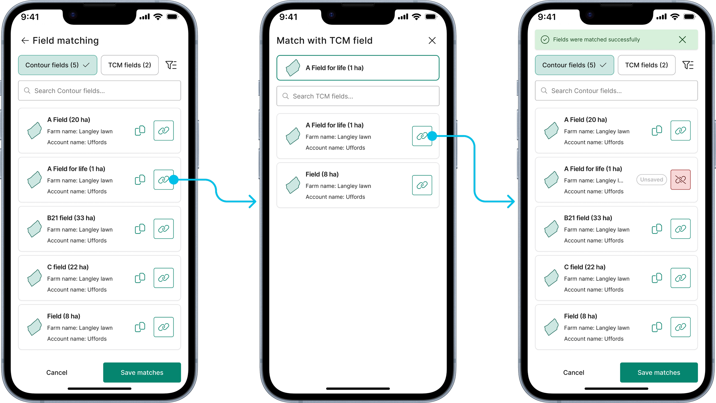
For the desktop version, the design mirrored the mobile experience but offered more detailed information (~88% of our users primarily access field management through desktop, with some opting for tablets or mobile devices for on-site/field access). I expanded the matching flow to include more field data, allowing for greater control over field associations. Despite the increased details, the layout remained clean and user-friendly, ensuring that users could navigate and make precise decisions with ease.
Since delivering this piece, I have received extremely positive responses from TELUS and our users.
The product is currently being tested and validated, ensuring it meets both user needs and technical requirements.
The synchronisation piece is the next part of the puzzle.