

The mission
As the lead designer for Grow, I own the strategy to improve the accessibility and usability of account, farm, and field management. A core business goal for 2025 was to enhance the experience for users (covering ~9,000 farms and 1.7M+ hectares), ensuring the improvements align with user needs and drive better outcomes.
The big picture
With the retirement of the previous platform, Admin Toolbox, I was tasked with leading on the designs within Grow to efficiently onboard and manage farmer/agronomist portfolios.
Grow is a powerful, user-friendly platform created to simplify the onboarding process, streamline account management, and assist operations teams, ensuring a more usable, efficient and useful experience than its predecessor.
To achieve this goal, I focused on understanding user pain points, mapping out wireframes and workflows, and collaborating closely with key stakeholders across product and engineering.
Frequent discussions and workshops with Rhiza, the administrators for Grow, were also crucial in shaping the platform's features and ensuring it met the needs of its users.
By combining user research, data analysis, and iterative design, I developed UX solutions that addressed both immediate user needs and long-term business objectives, ensuring a accessible and scalable experience.
The process
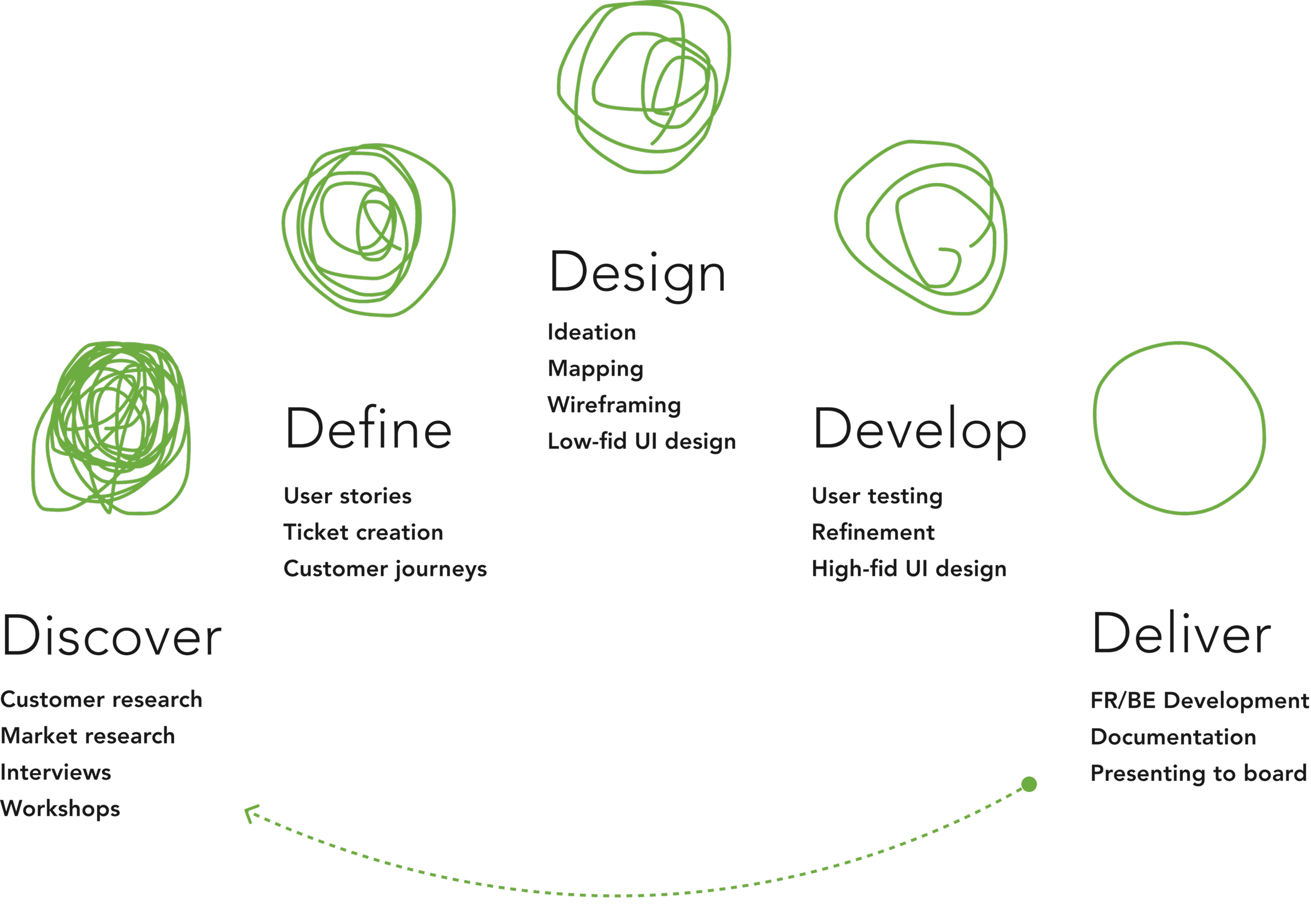
By utilising the proven 5D product framework, the team went through a continuous cycle of iterative improvement, refinement, and implementation.
This approach ensured that we consistently delivered high-quality and user-centric solutions by focusing on key stages: Define, Discover, Design, Develop, and Deliver. Each phase built upon the previous one, allowing us to adapt quickly based on user feedback and data.
By maintaining a cycle of continuous iteration, we were able to refine designs, enhance usability, and ensure that the designs aligned with user needs and business goals.
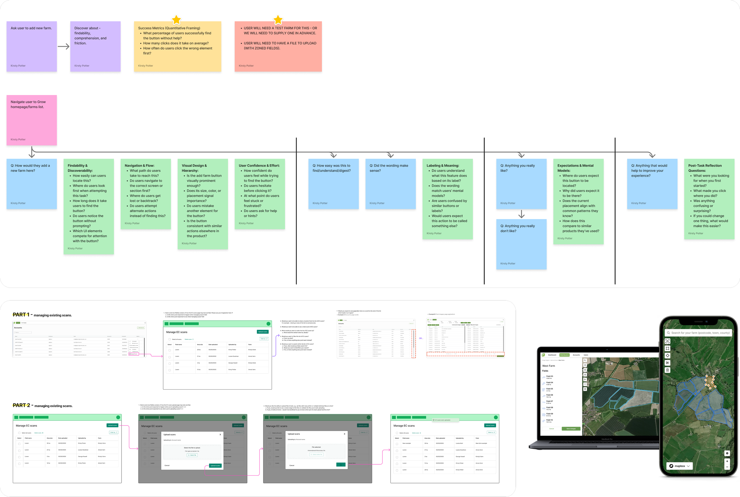
We conducted interviews with users and Rhiza, to understand requirements
-
"How do you currently create, edit, and manage field boundaries, and where do they experience friction in that process?"
-
"What level of accuracy do you expect when drawing or importing field boundaries, and how do you verify that accuracy?"
-
"How do you handle changes to field boundaries over time (e.g. splitting fields, merging fields, seasonal adjustments)?"
Research analysis
By asking open-ended, task-focused questions during user interviews with both users and Rhiza, I uncovered patterns in behaviour and needs, which were summarised into actionable insights.
I also conducted an audit of the existing Grow flows to identify areas where they aligned with or differed from the research findings.
This audit helped me understand which existing workflows were effective and where improvements were needed, ensuring that the new designs would integrate smoothly with current processes.
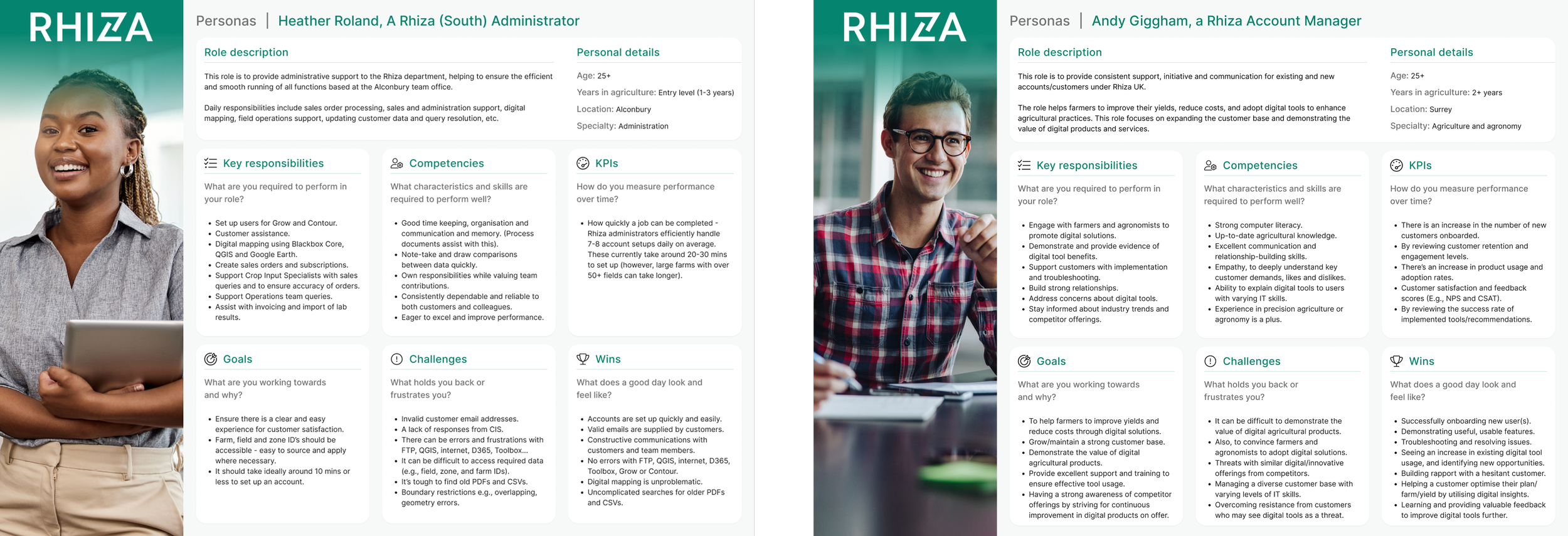
Personae
I created personas to capture user needs and behaviours, informing design
decisions and guiding feature prioritisation. This helped us to define the roadmap phases.
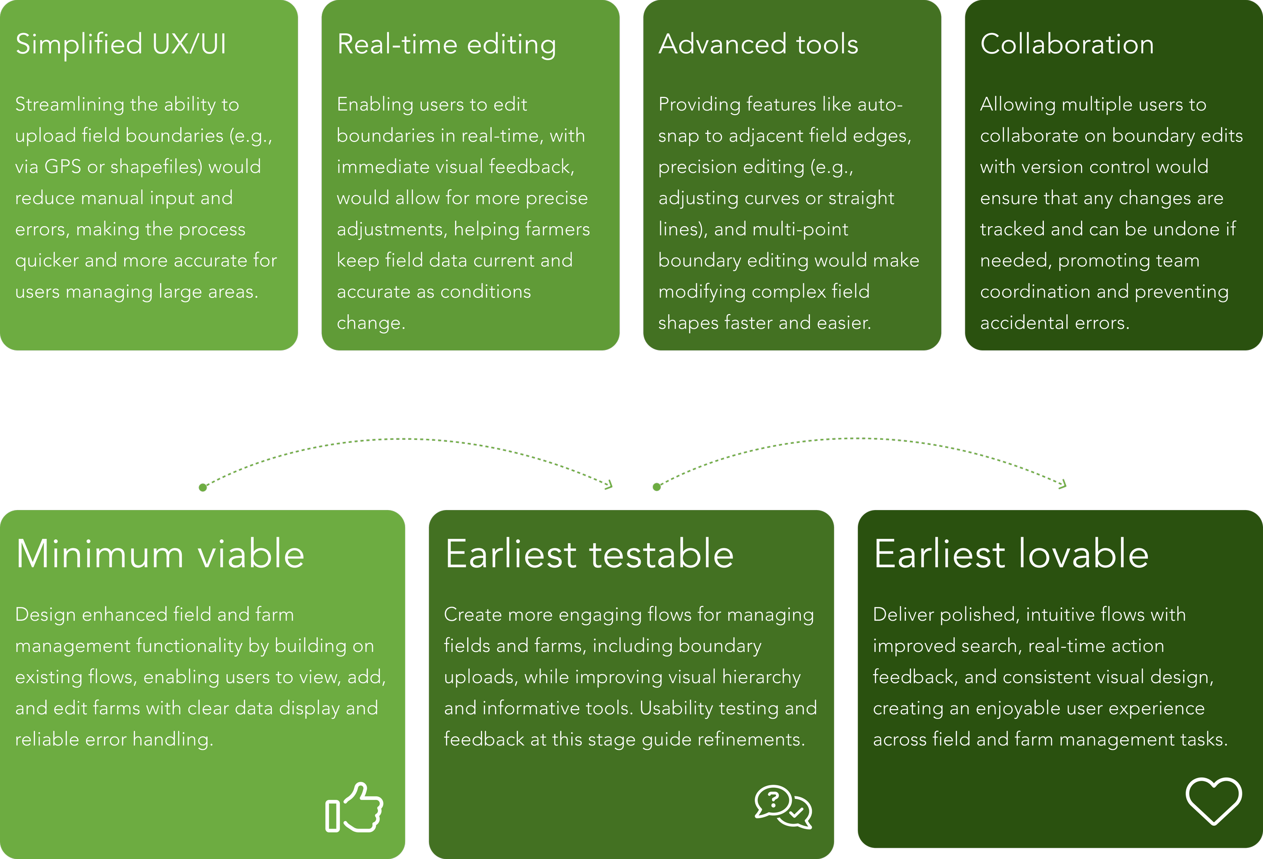
Key opportunities
Through analysis of the user research, I created clear themes that directly informed design decisions and product direction.
Roadmap phases
We followed a phased roadmap showing the evolution from core functionality to a polished, user-friendly experience.
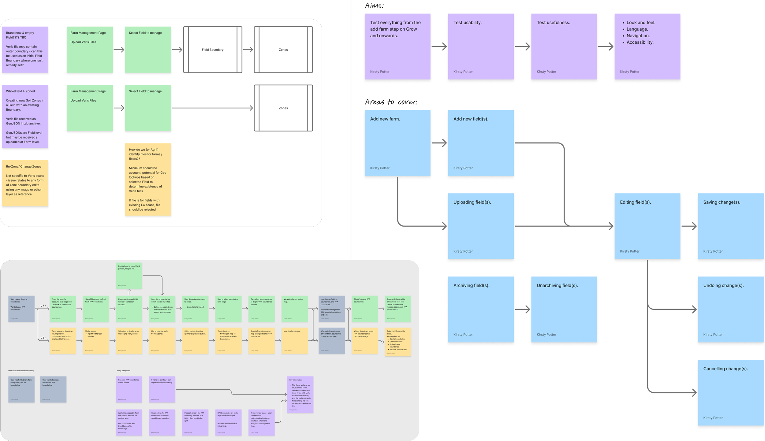
Farm-field related flows
Mapping early user journeys was essential in visualising workflows, identifying pain points, and uncovering opportunities for improvement.
Friction points identified in farm & field management:
Difficult field and zone management: Adding, editing, and assigning zones was not intuitive, causing delays.
Navigational Issues: Users struggled to switch between fields and zones efficiently. Searching for locations to place your farm, wasn’t easy either.
Uploading boundaries was a chore: Users encountered challenges uploading files, and wanted to validate field boundaries being uploaded on Grow before completion. Simplifying this process was a key requirement for the MVP.
Old design system components: Legacy components remained in the product, so retiring them was necessary to ensure a consistent, design-system-aligned user experience.
These friction points have therefore been addressed in the MVP, with much more to be refined as we continue to gather user feedback and iterate on the product.
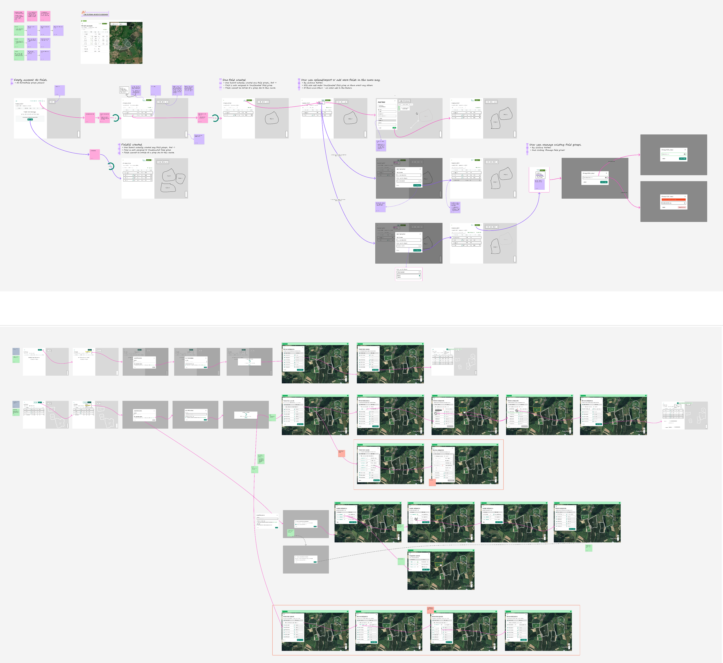
Wireframing / low-fidelity mock ups
I created low-fidelity wireframes to quickly visualise and test key user journeys, addressing the identified friction points.
These wireframes focused on simplifying complex tasks like field and zone management, file/boundary uploads, and navigation.
They allowed for rapid iteration and user feedback, ensuring that core functionality was intuitive and aligned with both user needs and the overall design system.
The results
Adding and editing boundaries
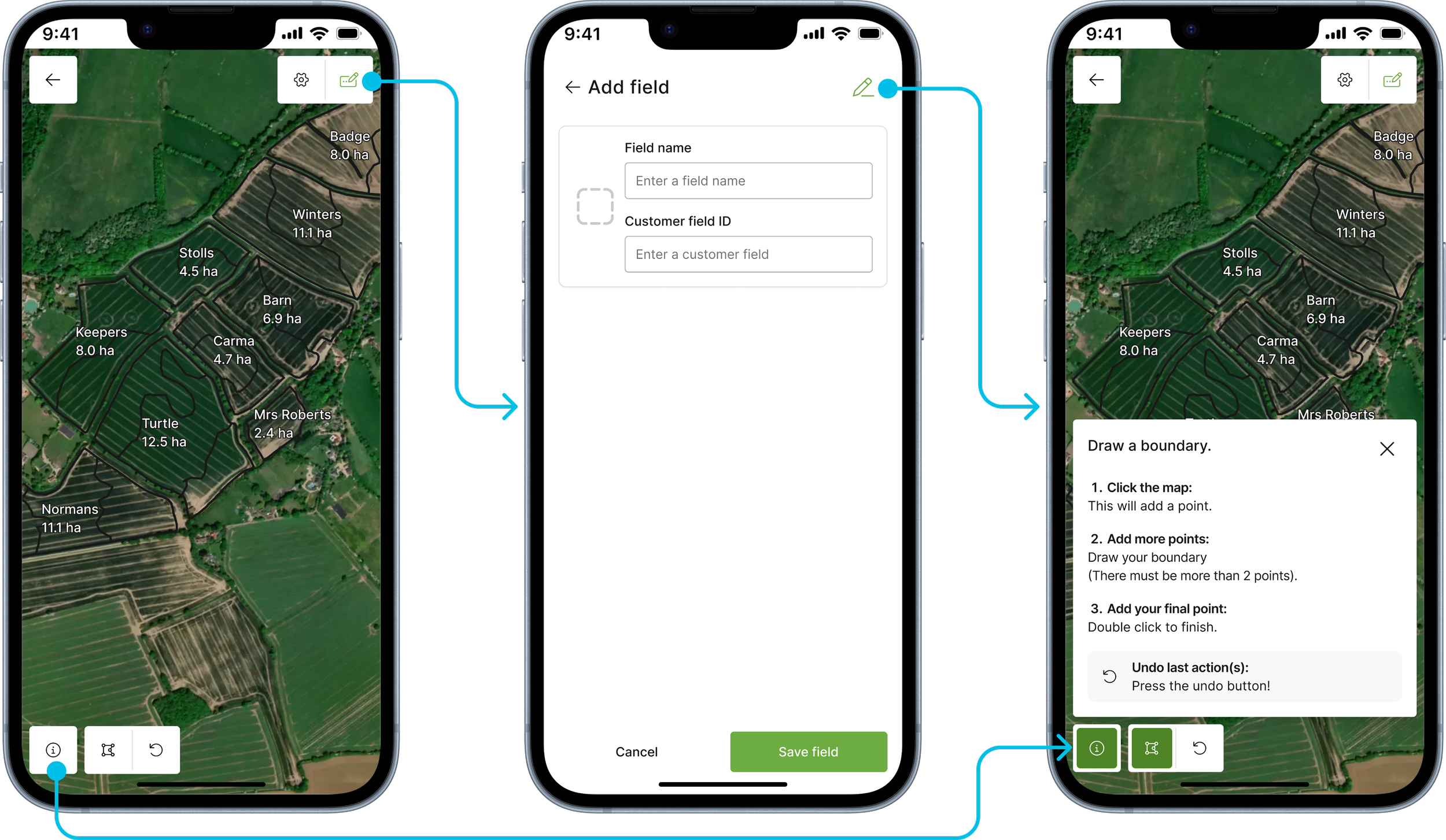
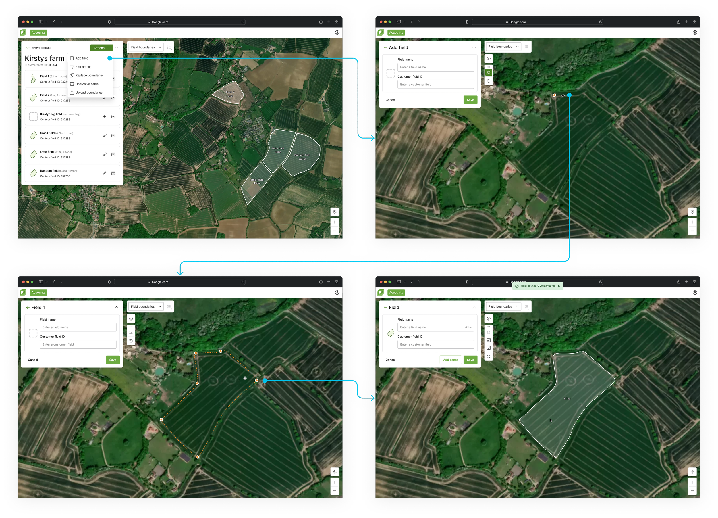
I designed a streamlined process for adding fields that was intuitive and efficient.
On mobile, the flow was optimised for smaller screens (browser only - App version is due on a later release), allowing users to easily input field details (name and customer field ID) and draw boundaries with minimal steps.
For desktop, I expanded the layout to accommodate additional data and provide more context, while ensuring the process remained quick and user-friendly. The design ensured consistency across platforms while catering to the unique needs of each device.
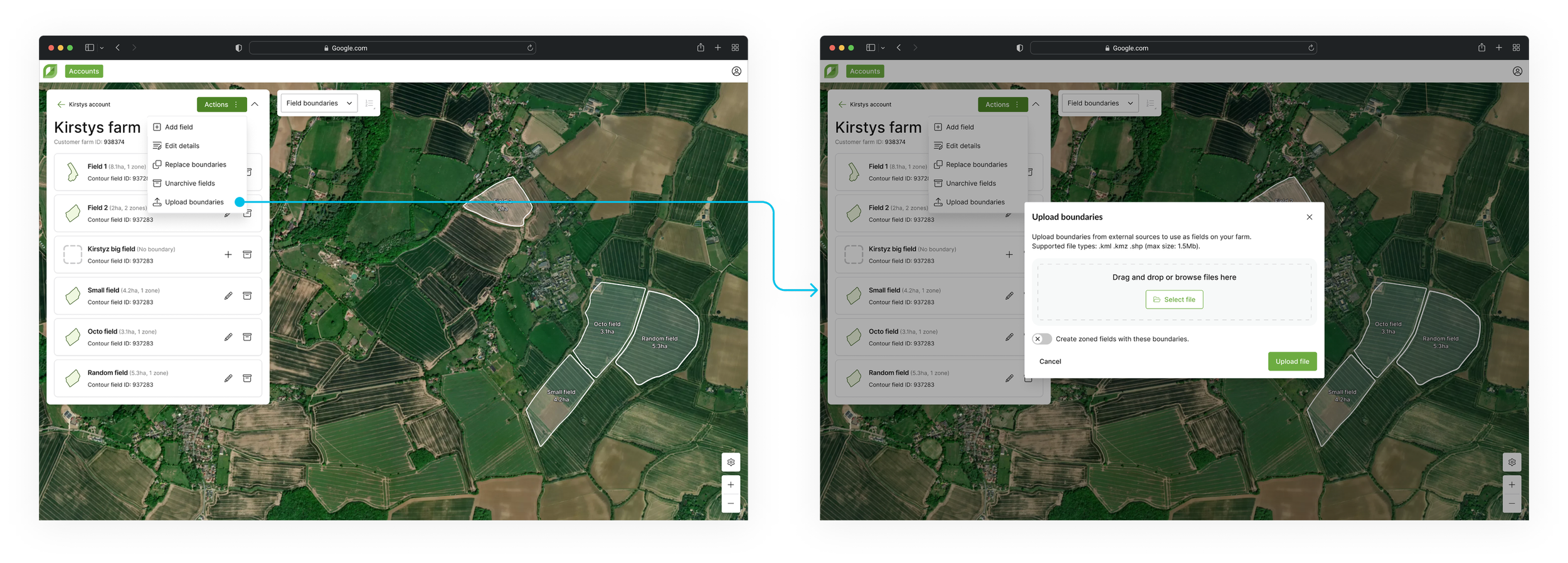
Uploading boundaries to farms
I designed a seamless file upload process, allowing users to upload boundary data for fields and zones. The upload flow supports multiple file types (.kml, .kmz, .shp), ensuring flexibility in how users submit their data.
A toggle was introduced post-MVP, to let users easily switch between uploading wholefields (fields with only one zone) or zones (multiple), streamlining the process and reducing errors.
“Uploading the boundaries is so quick and I really like how easy it is to use. I have tested with all different file types and it works well.”
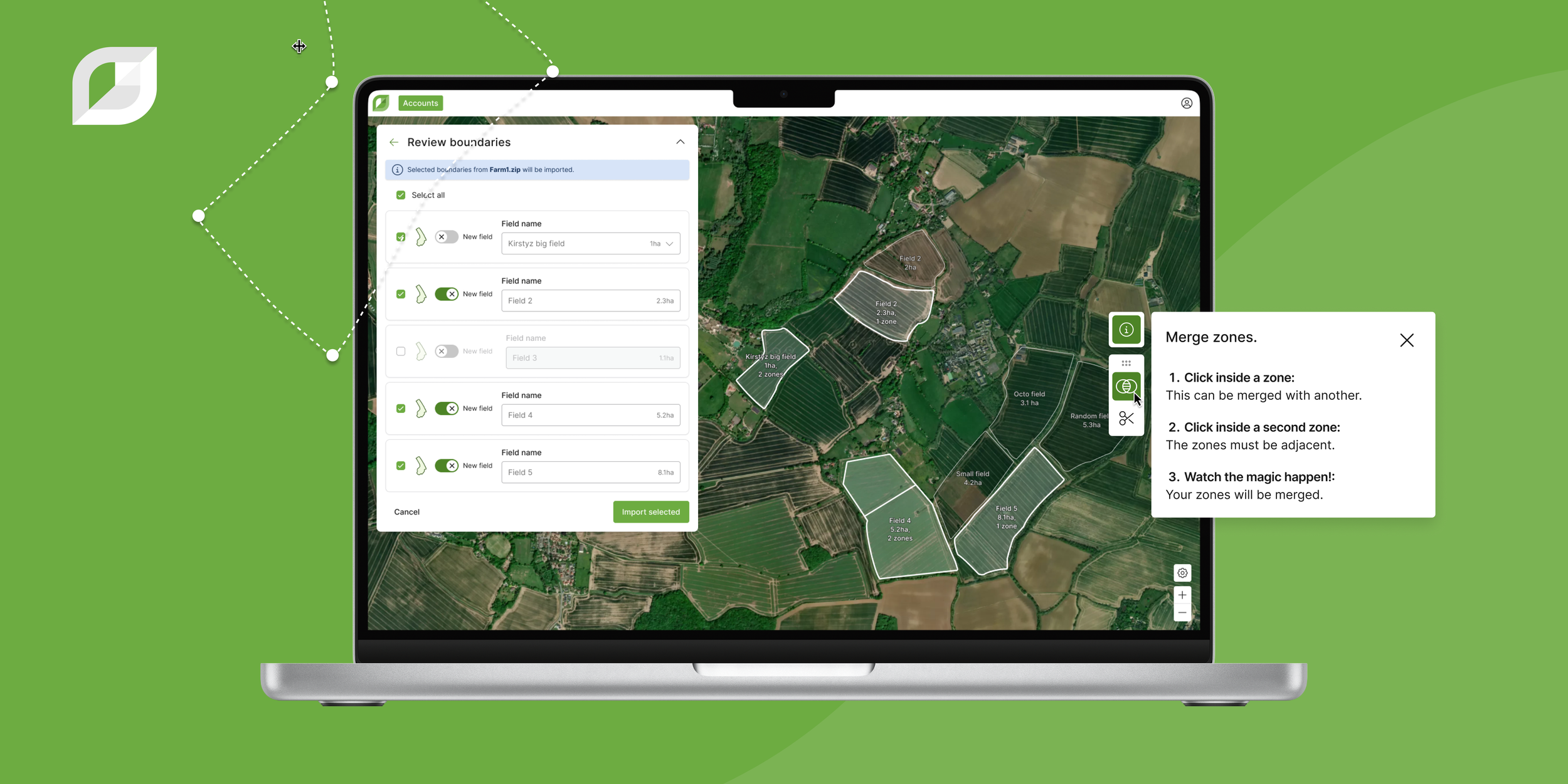
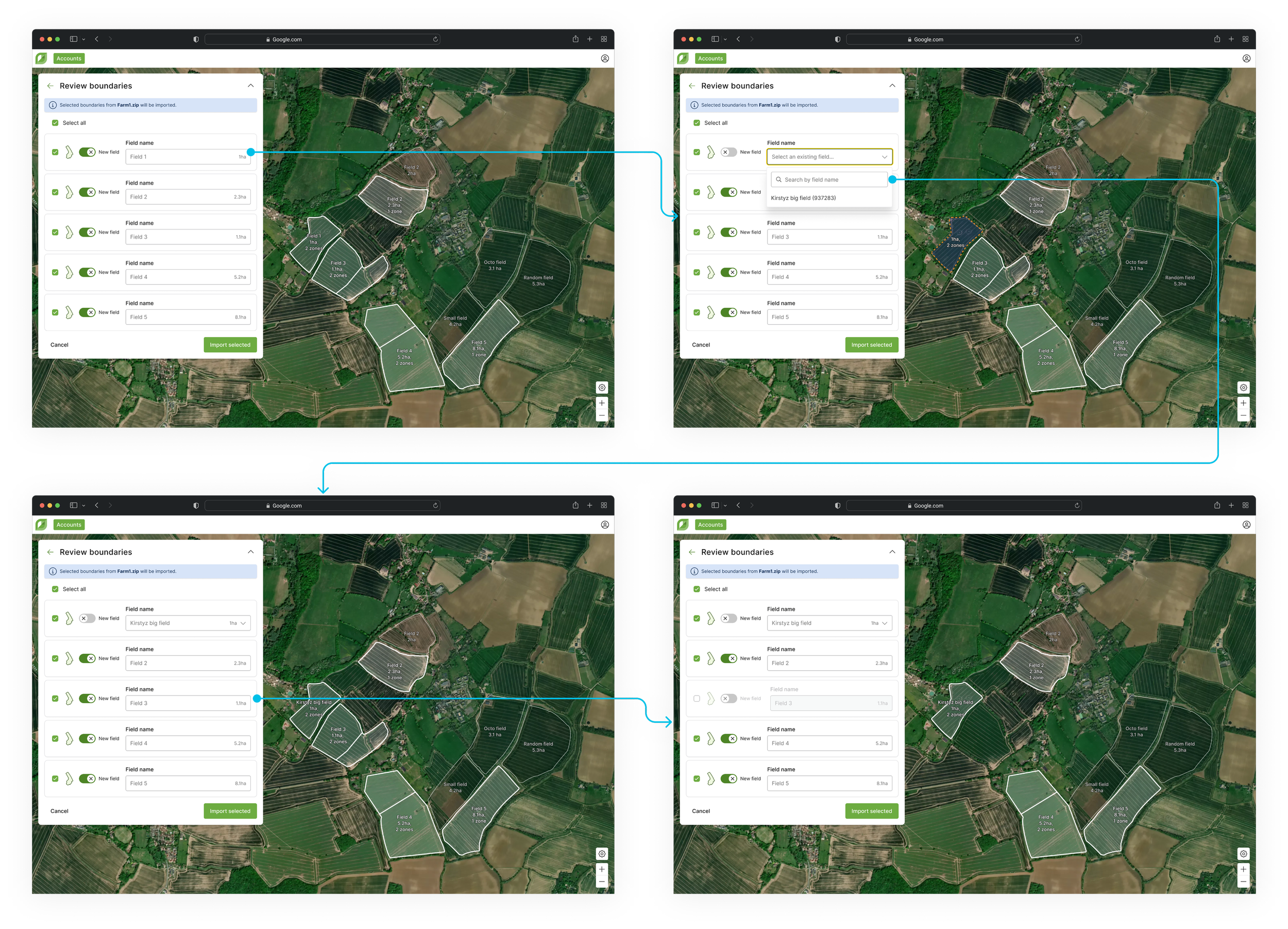
Reviewing boundaries post-upload
I incorporated a review step into the boundary upload process, allowing users to confirm the data they’re bringing into their farm. During this step, users can deselect field boundaries from the list if they don’t want to include them in the upload.
They have the option to assign boundaries to empty fields already within their farm, a feature useful for bulk assignments later, especially when multiple administrators/users are involved. Alternatively, they can upload them as automatically named new fields, renaming them (if they wish) inline. This flexibility allows users to make adjustments before completing uploads, with the ability to easily update fields at any point in the future.
Since delivering these pieces, I have received widely positive responses from users and Rhiza.
QA, the product managers and I will continuously monitor, review and test the experience, to ensure it meets both user needs and technical requirements.