

The mission
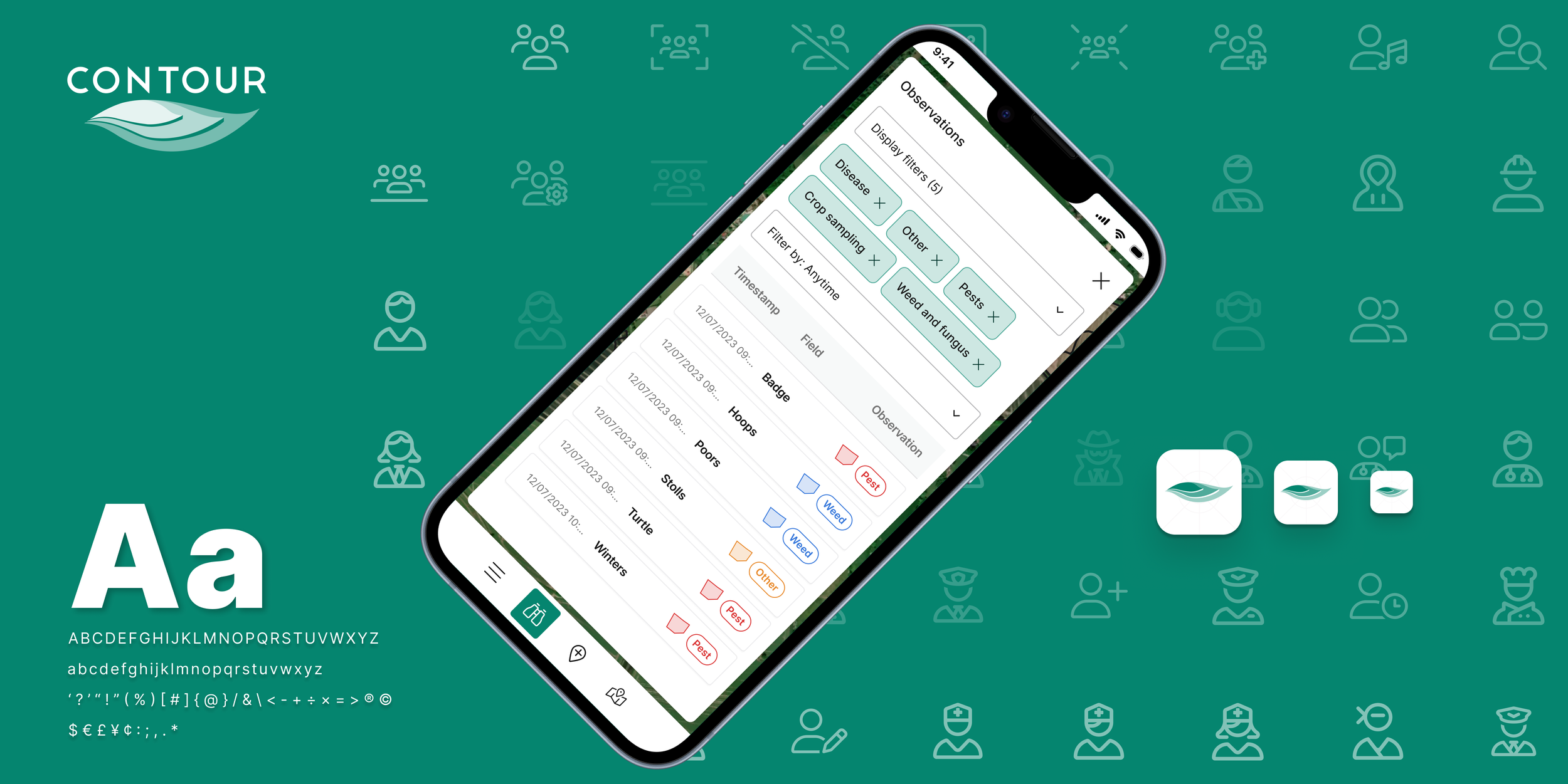
Being a part of the product design team at Origin Digital, we focused mostly on Contour, a precision agriculture platform focused on field boundaries and data accuracy.
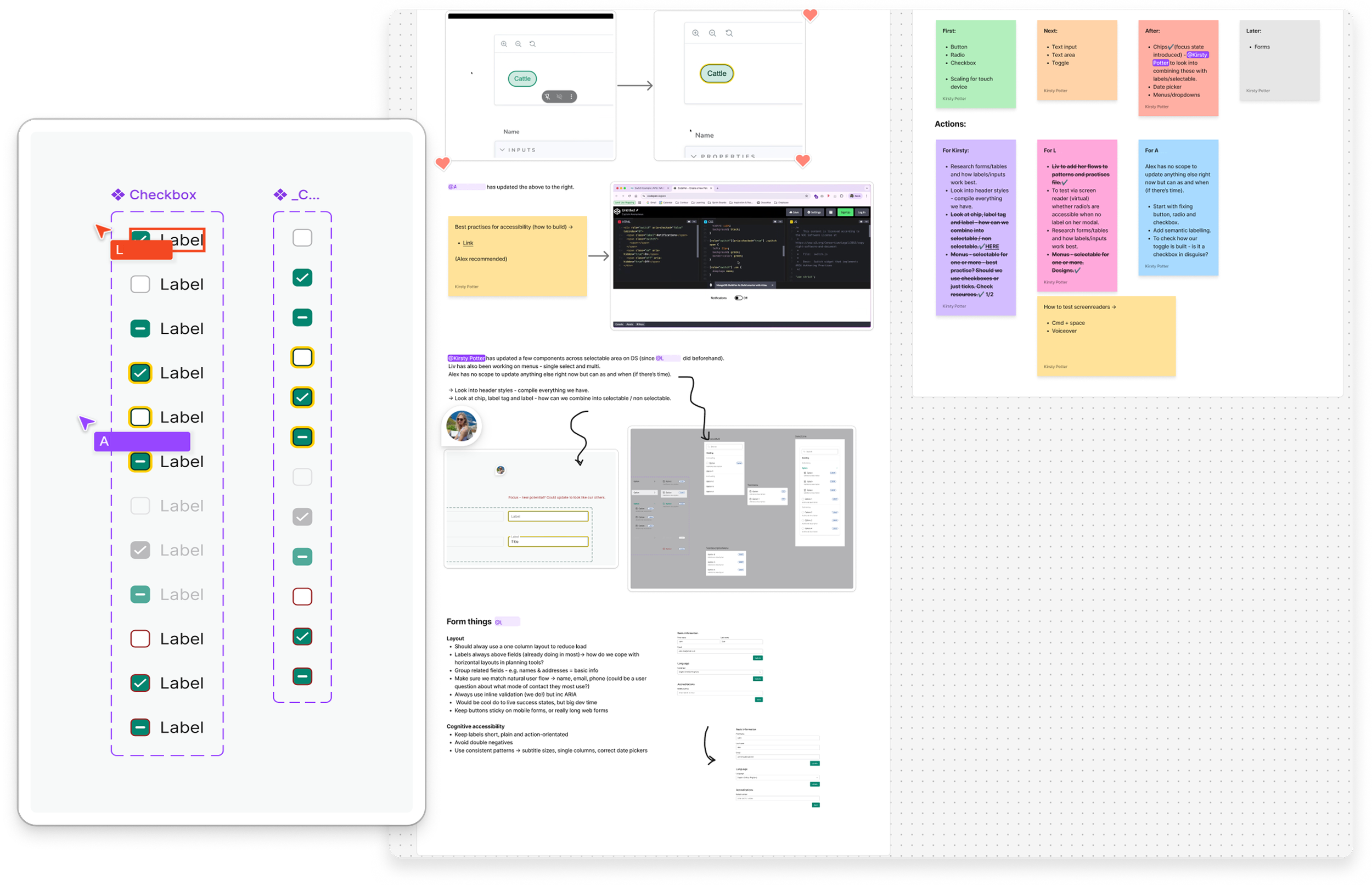
As part of ongoing design system operations, I collaborated with junior designers and front/back-end engineers to identify and implement areas for improvement.
I ran monthly sessions, which resulted in the creation of a clear set of updates to make the system more accessible, manageable, and consistent.
We started conceptualising
Prioritising key enhancements
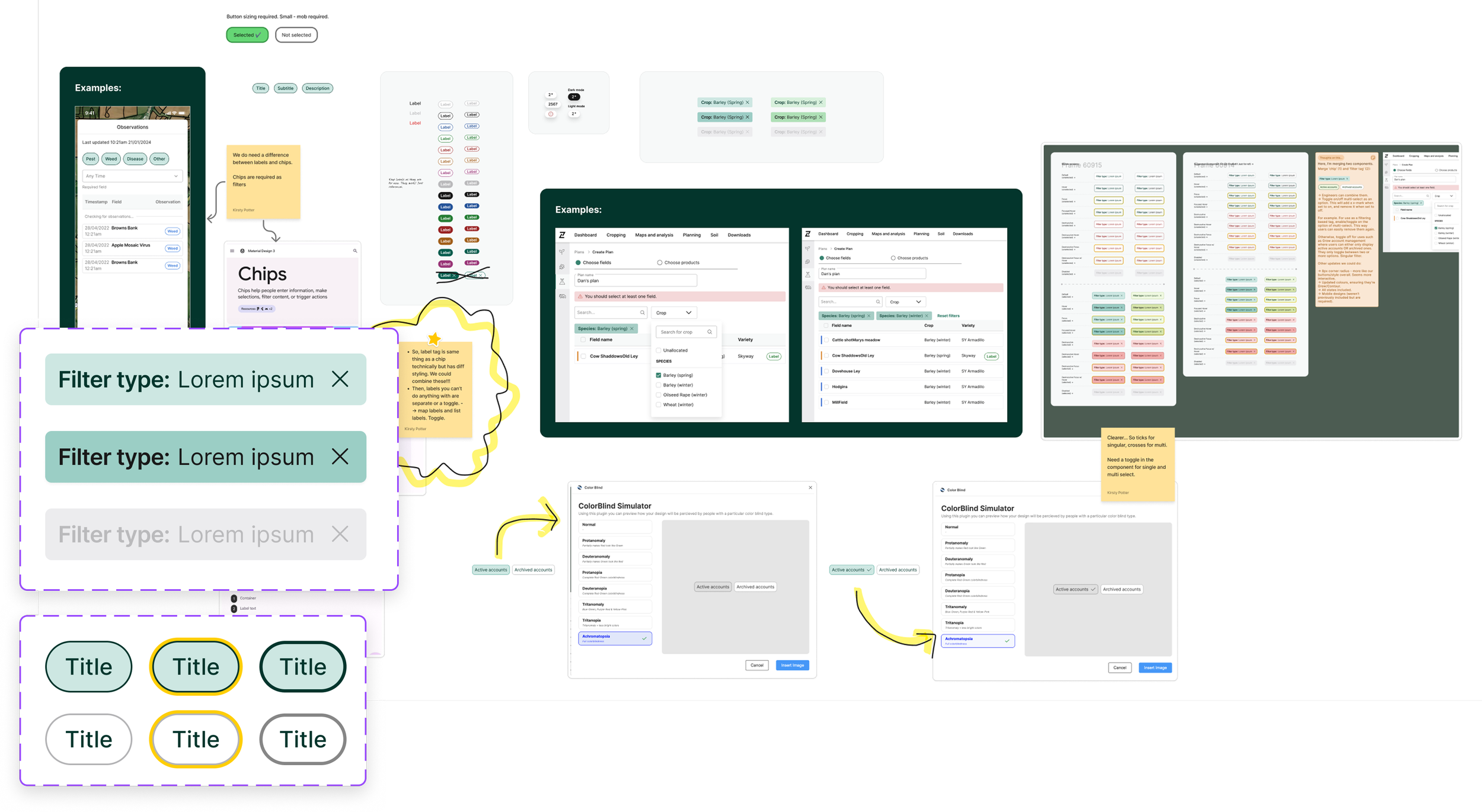
We identified opportunities to merge overlapping patterns while improving accessibility for users with visual impairments.
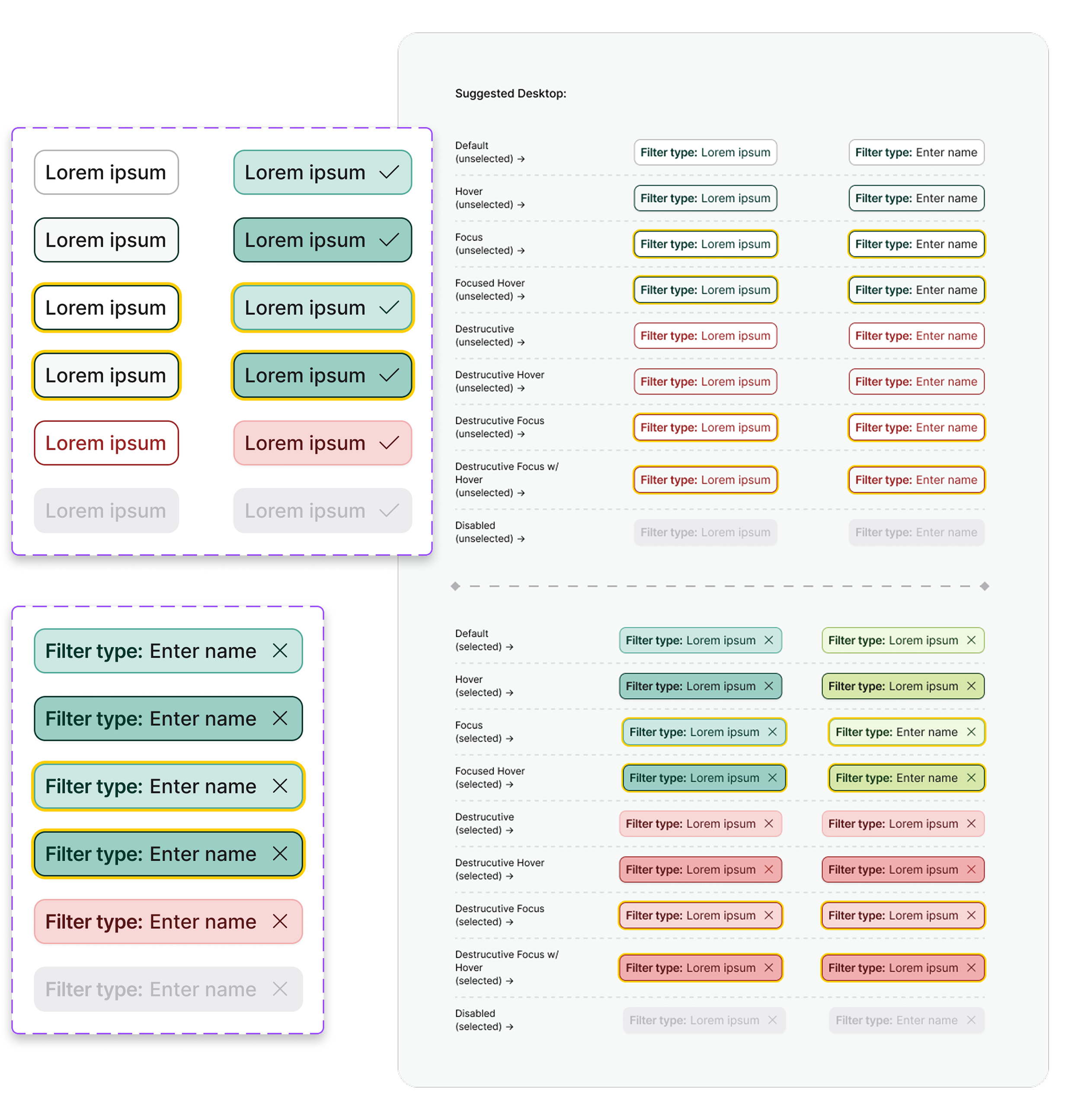
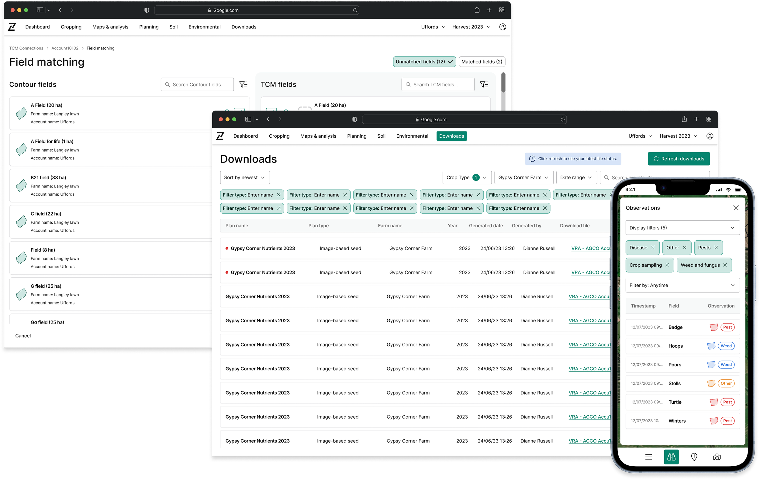
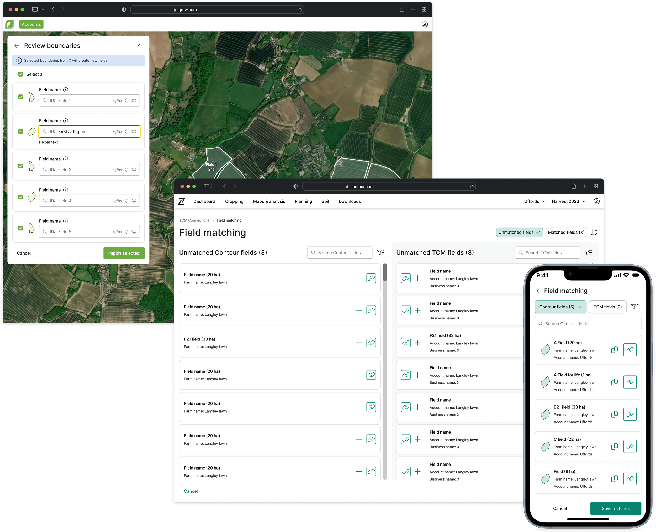
I led the redesign and consolidation of the chip and filter tag components into a single, responsive, and accessible component. The final solution was documented in StoryBook, establishing a unified and scalable approach within the design system.
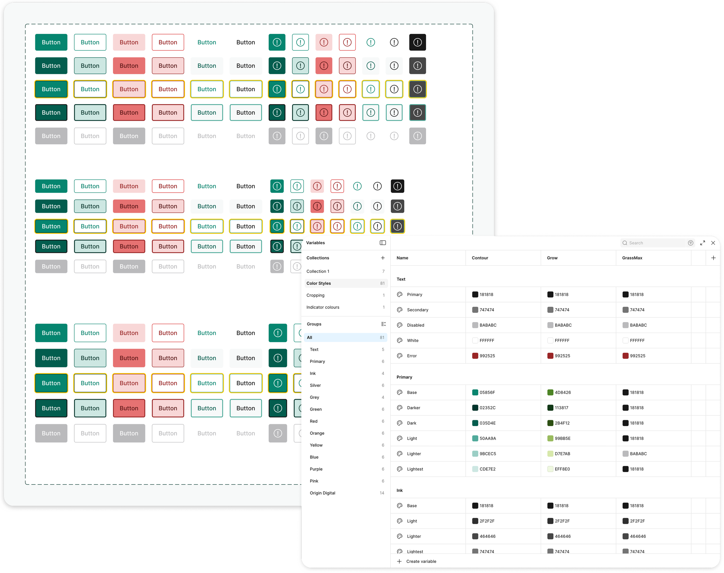
I also looked into the button component (improving it’s accessibility and usability) and created a selectable summary card component - to be used across a mix of scenarios.
As part of the redesign of the chips/filter tags and buttons, I evaluated the components for accessibility.
On the chip components, I added checkmarks to make it extra clear whether something was selected or not.
This change improved visibility and reduced ambiguity for users with visual impairments, particularly those with Achromatopsia - the previous design lacked sufficient visual distinction and could be mistaken for a disabled state.
Accessibility matters
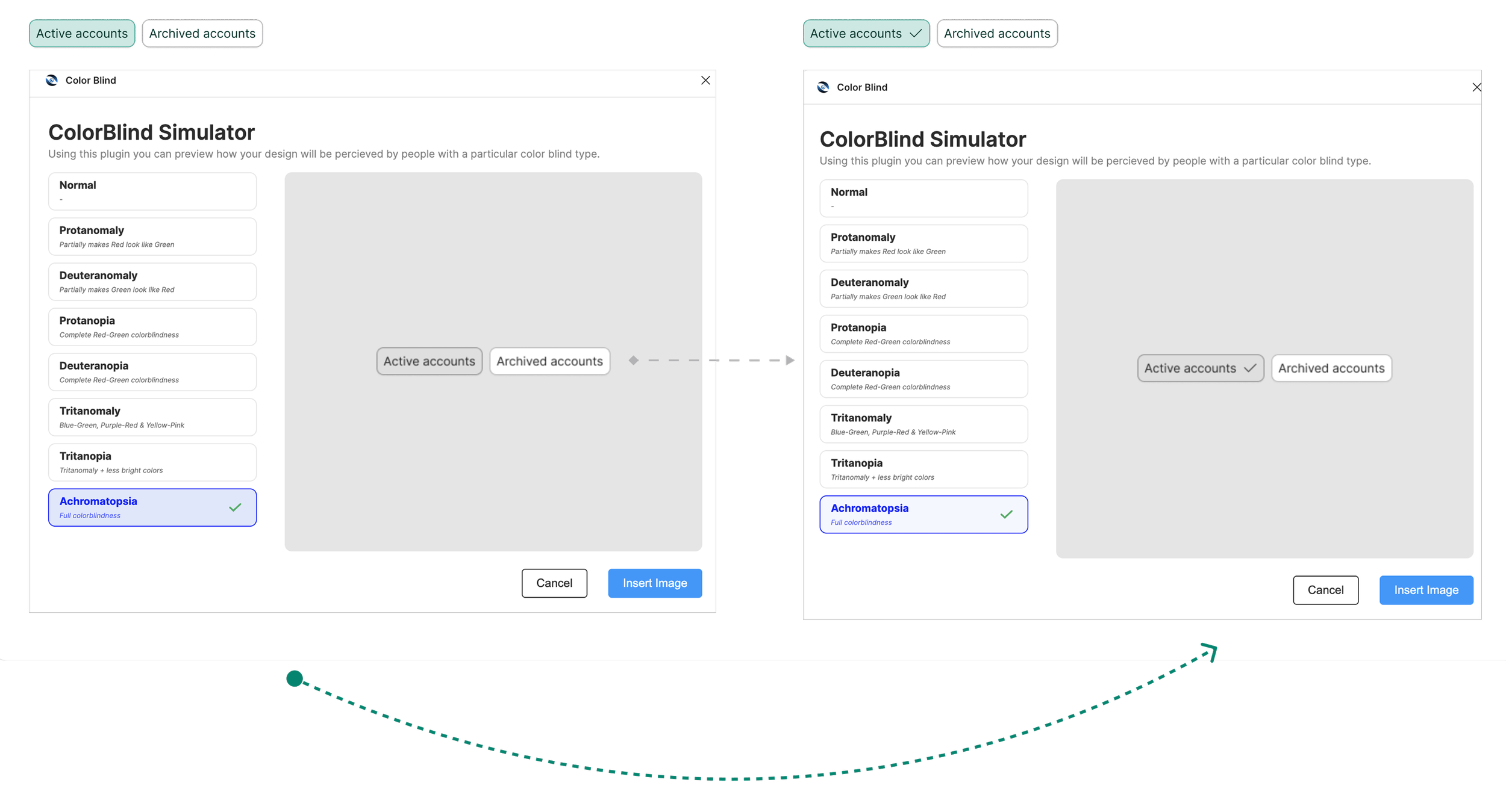
I combined the chips and filter tags into a single component, and designed highly accessible states (AAA) with clear selection indicators, including checkmarks.
I ensured adequate visual contrast and built in keyboard and screen reader support (ARIA), creating a more inclusive and user-friendly experience.
States and sizing
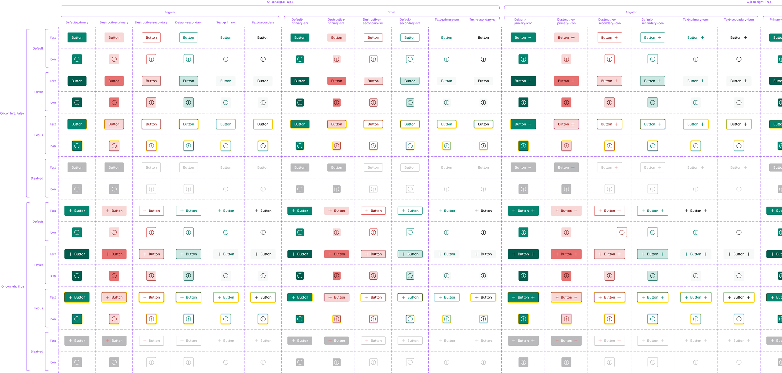
I reviewed the existing button component, and updated it to use accessible colour combinations across all interaction states, including default, hover, focus, active, and disabled. The variable library was updated as a part of this process.
The changes were guided by accessibility contrast standards to ensure clarity and usability for all users.
This improved button component was then applied consistently across three products (Grow, Contour and GrassMax), creating a more inclusive experience while also strengthening visual consistency.
Colours for everyone
The creation of a clear instance table for the updated button component documented variants, states, and usage guidelines to ensure consistency and ease of adoption.
Instances
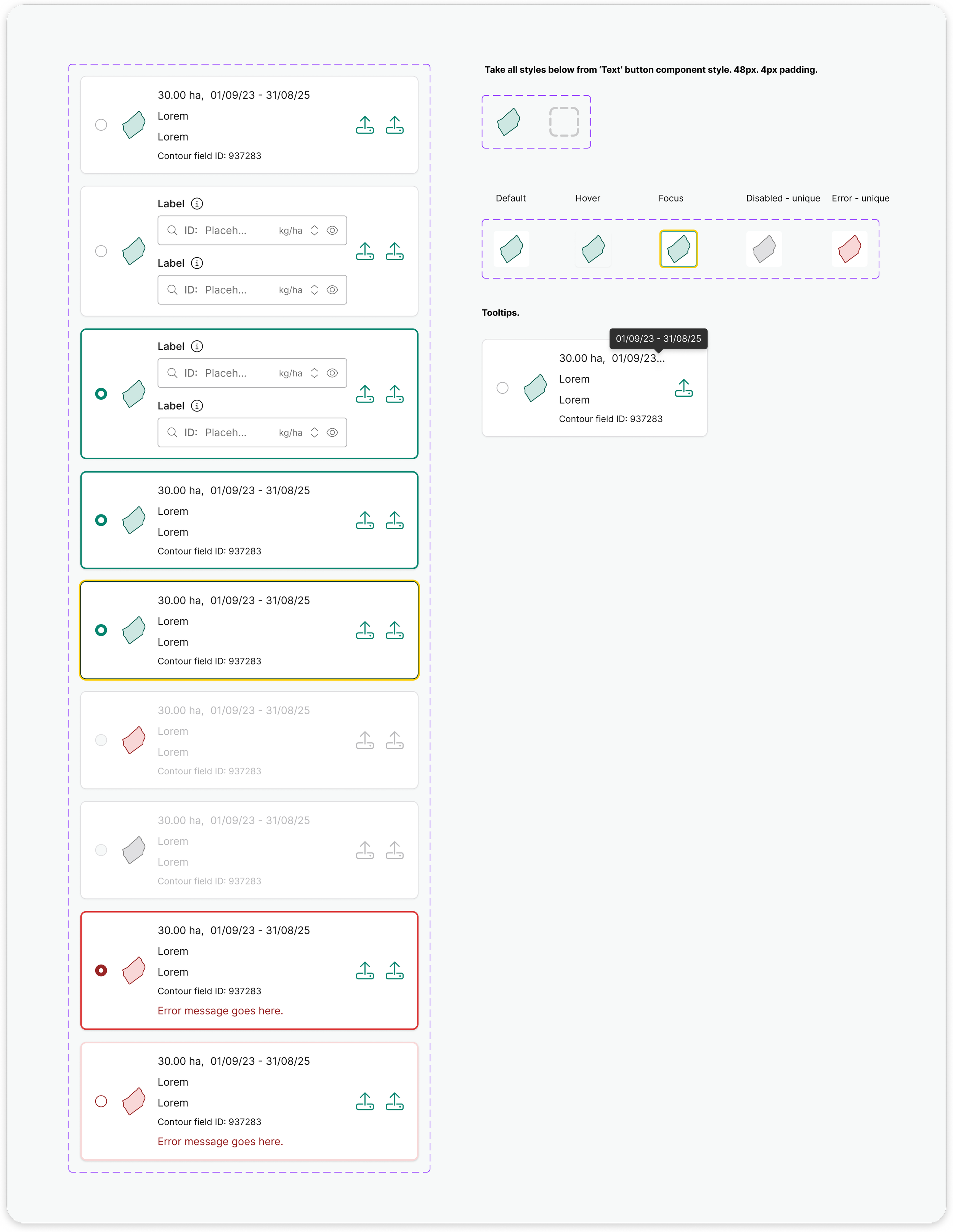
I designed and refined selectable summary cards, ensuring they were flexible enough to support different contexts while remaining visually consistent.
The component accounted for all states, with accessible colour and contrast choices to support usability for all users.
By standardising the card UI and behaviour within the design system, the component has been easy to use at scale and has helped to create a more cohesive experience across Origin Digital’s products.
Selectable summary cards
The results
The final outcome for the chip and filter tag component was the visual refinement and merging of two overlapping components into a single, unified component in Storybook.
This has reduced redundancy within the design system, improved accessibility and consistency across interfaces, and provided a clearer, more maintainable pattern for designers and engineers alike.
The selectable summary card component has been used across multiple areas of Origin Digital’s products to present key information in a clear, responsive and scannable format.
Its reusable structure allows teams to apply it confidently in different contexts, helping streamline layouts and reinforce a cohesive user experience.
Buttons are now accessible, usable and useful - translated into different colour schemes per product.