

Primark site re-launch & Editorial Desk
CMS • Digital Design • UX/UI • User Research
The mission
I reviewed the existing Primark site, which serves millions of users, to identify gaps and opportunities for improvement.
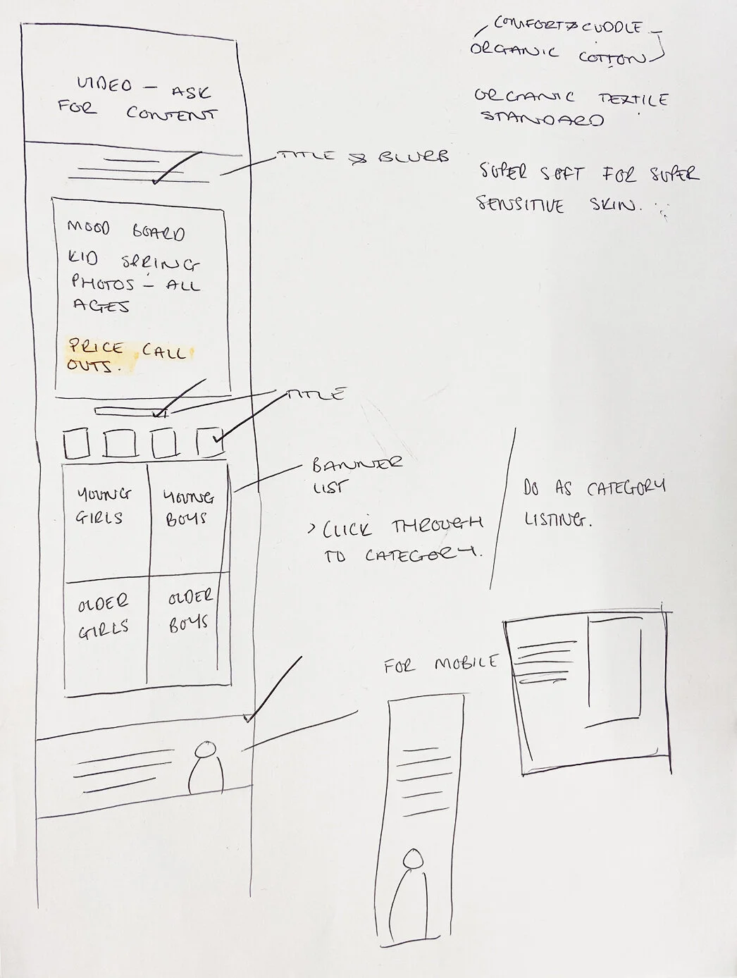
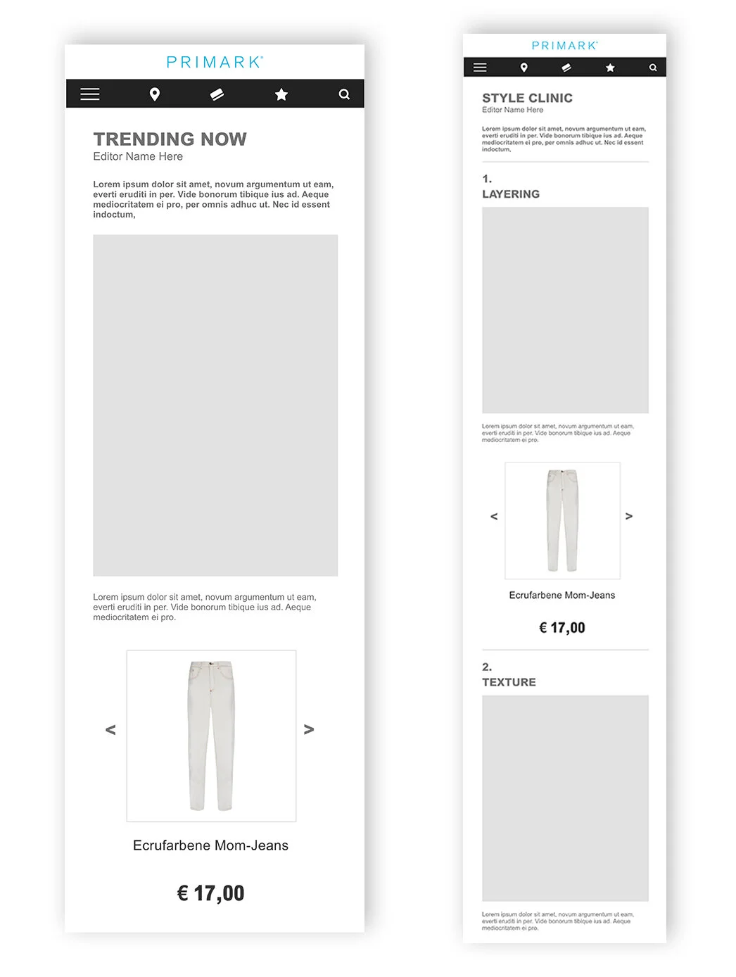
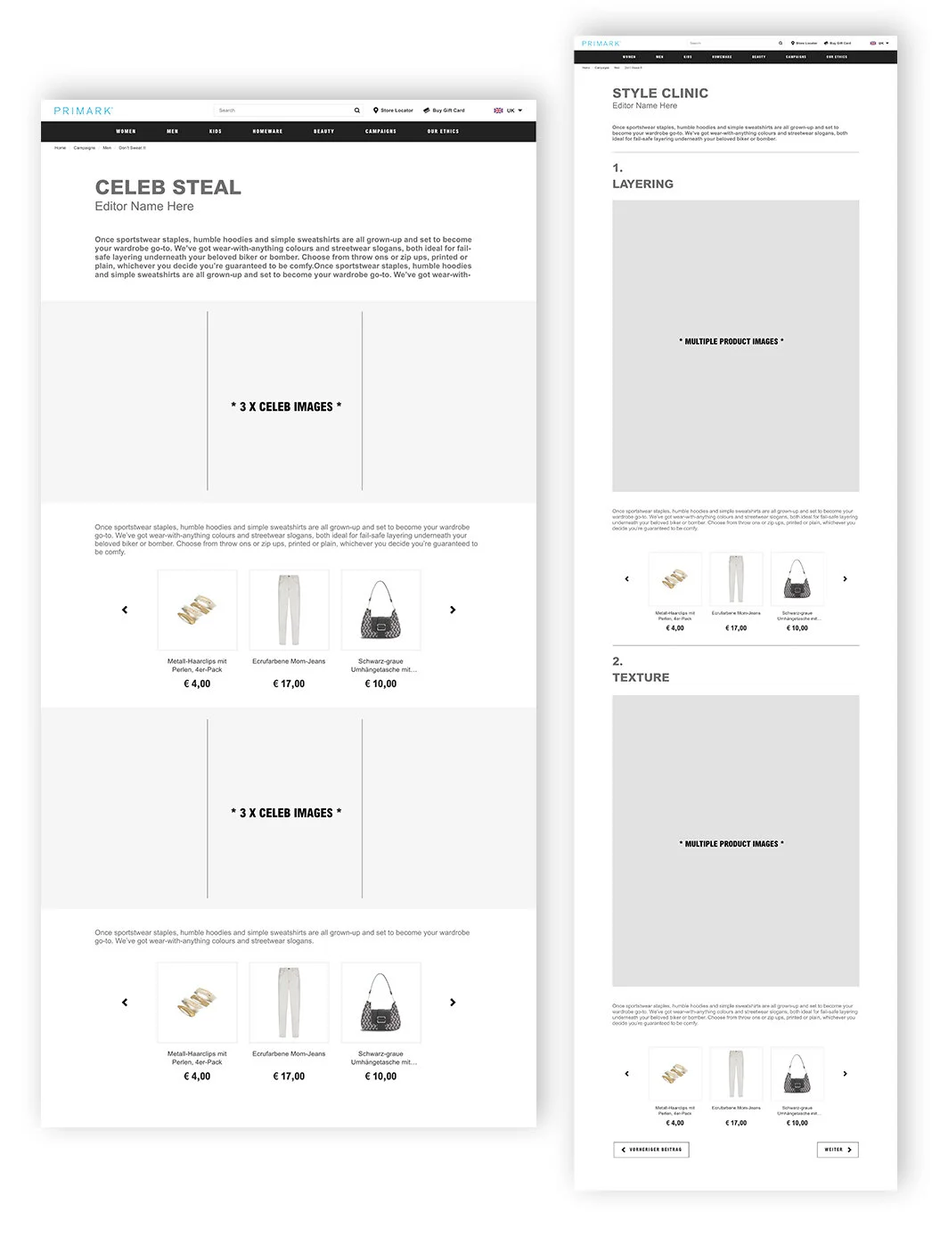
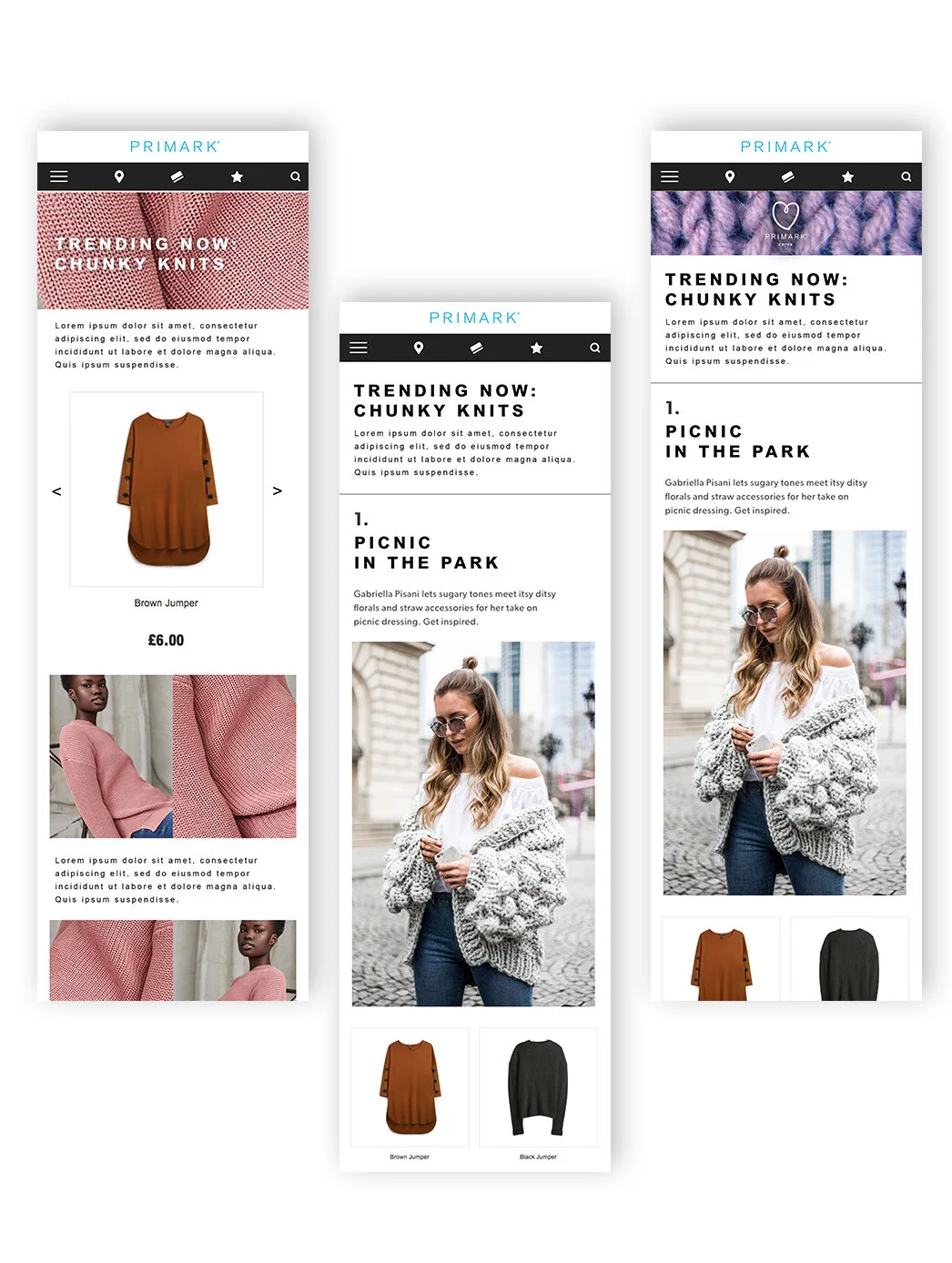
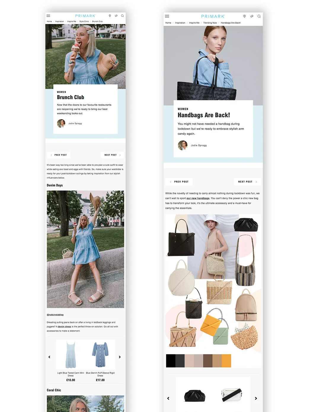
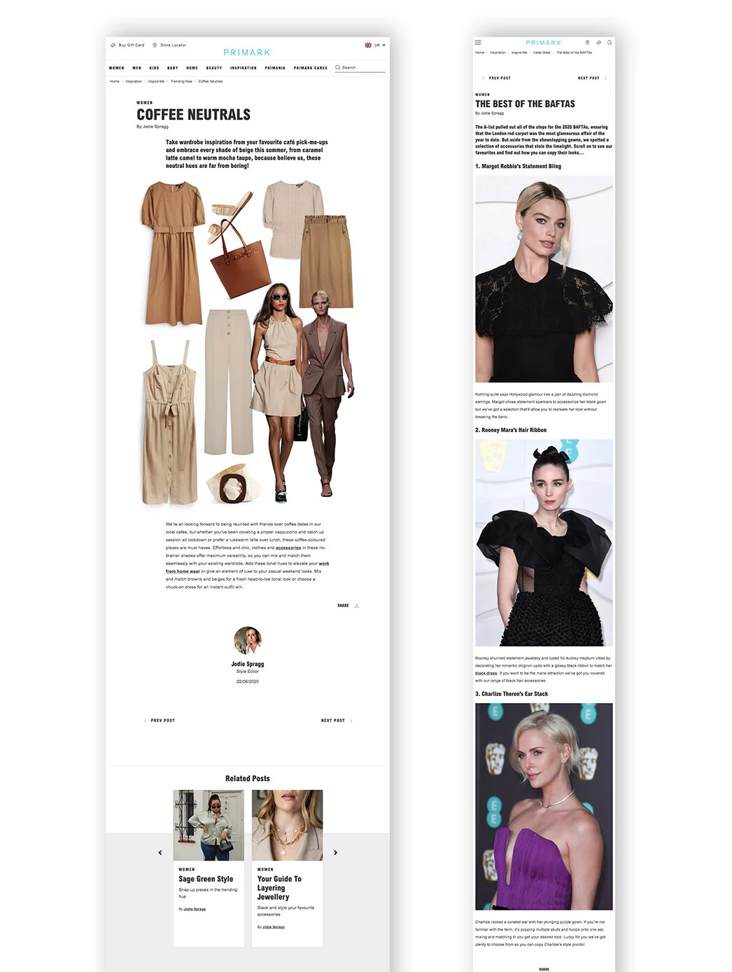
I proposed new layouts and designed wireframes for a dedicated editorial section (called ‘Editorial Desk’ - now known as ‘Inspiration’), featuring trending topics, style guidance, and celebrity-inspired looks, all tailored to fit within a Primark budget.
The process
I conducted competitor analysis alongside user research through an anonymous survey.
This helped identify how fashion content is currently being presented in an editorial context, as well as uncover user expectations and opportunities for new page concepts and content.

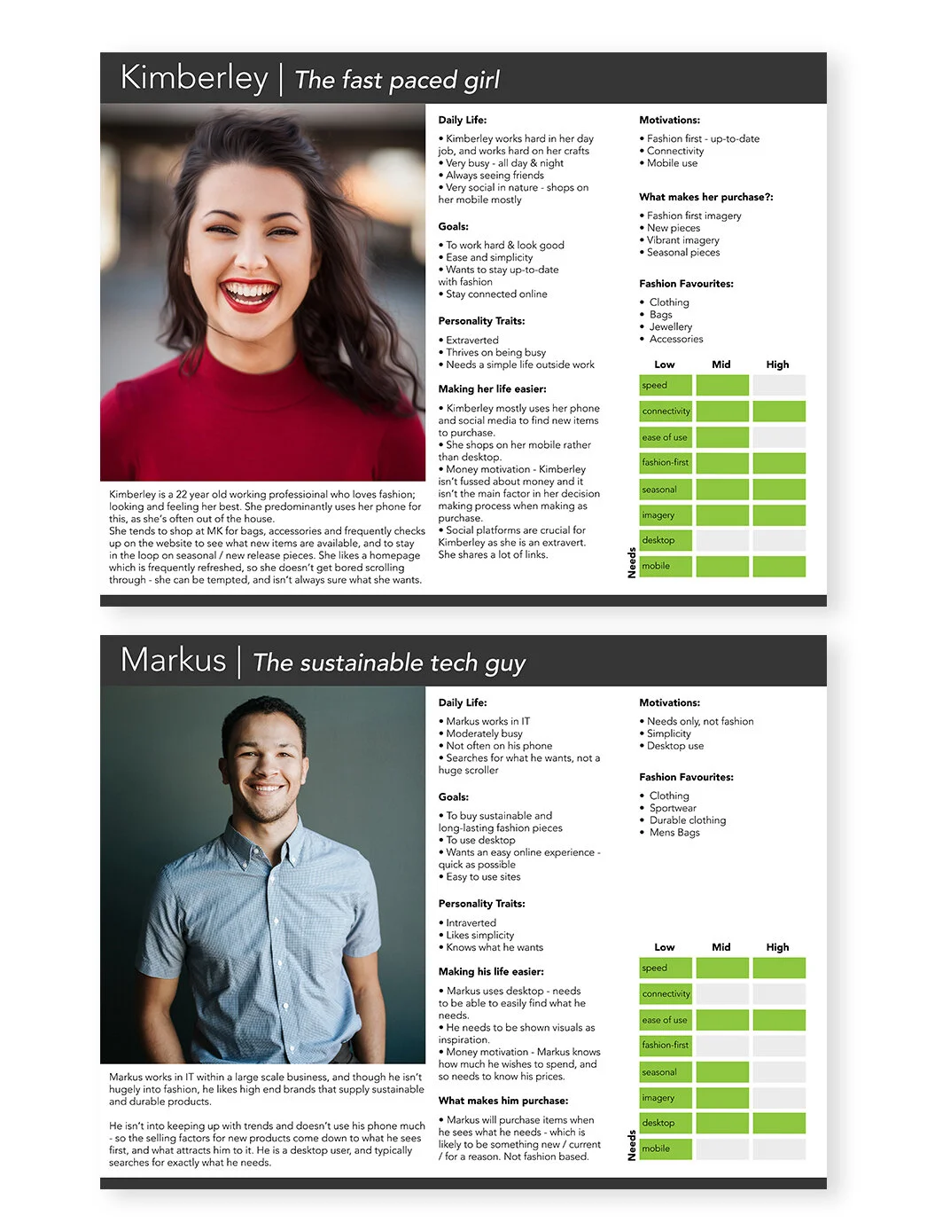
Personae and user stories
I conducted online research into the typical Primark customer, which informed several key homepage requirements. The homepage should always act as a central, inspirational hub for “newness” - connecting all content and collections in one place.
It needed to be comprehensive and inclusive, serving as a destination where users can find everything they need. The site must stay current with seasonal collections and collaborations to appeal to a millennial audience, while also presenting an opportunity to better highlight menswear, which is currently underrepresented.
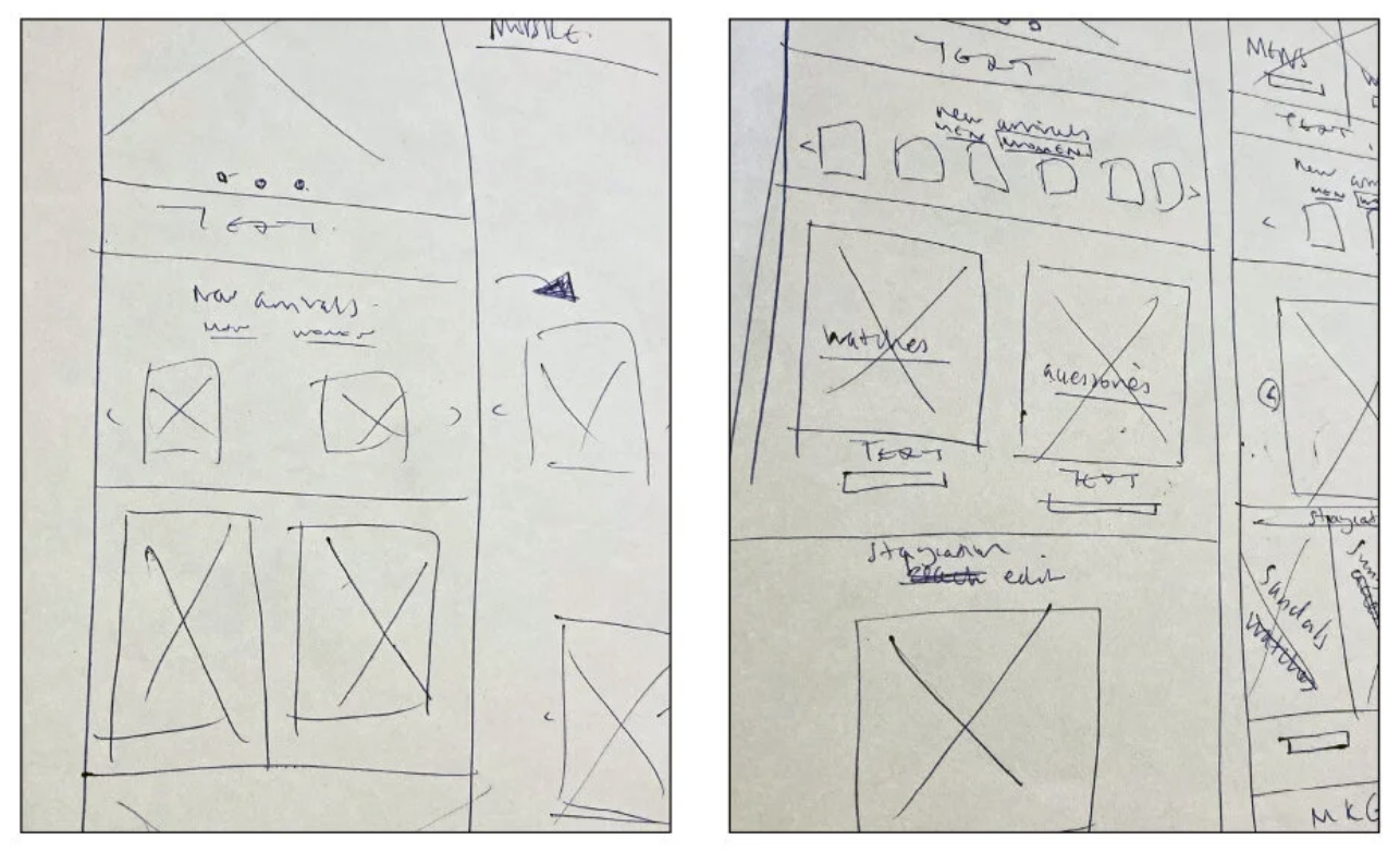
Consistent, clear designs was key
I designed wireframes informed by user research, focusing on introducing a sense of “newness” and momentum through refreshed content placement. I explored and tested a range of guest fonts, evaluating their visual impact to identify the most effective option.
The design balances the needs of different user types: for inspiration-led users like Kimberley, the hero banner highlights the latest content and collections, creating an engaging, editorial-style overview. For task-focused users like Markus, the experience prioritises clarity, simplicity, and functionality, with clearer access points and improved visibility of menswear products to support efficient navigation.
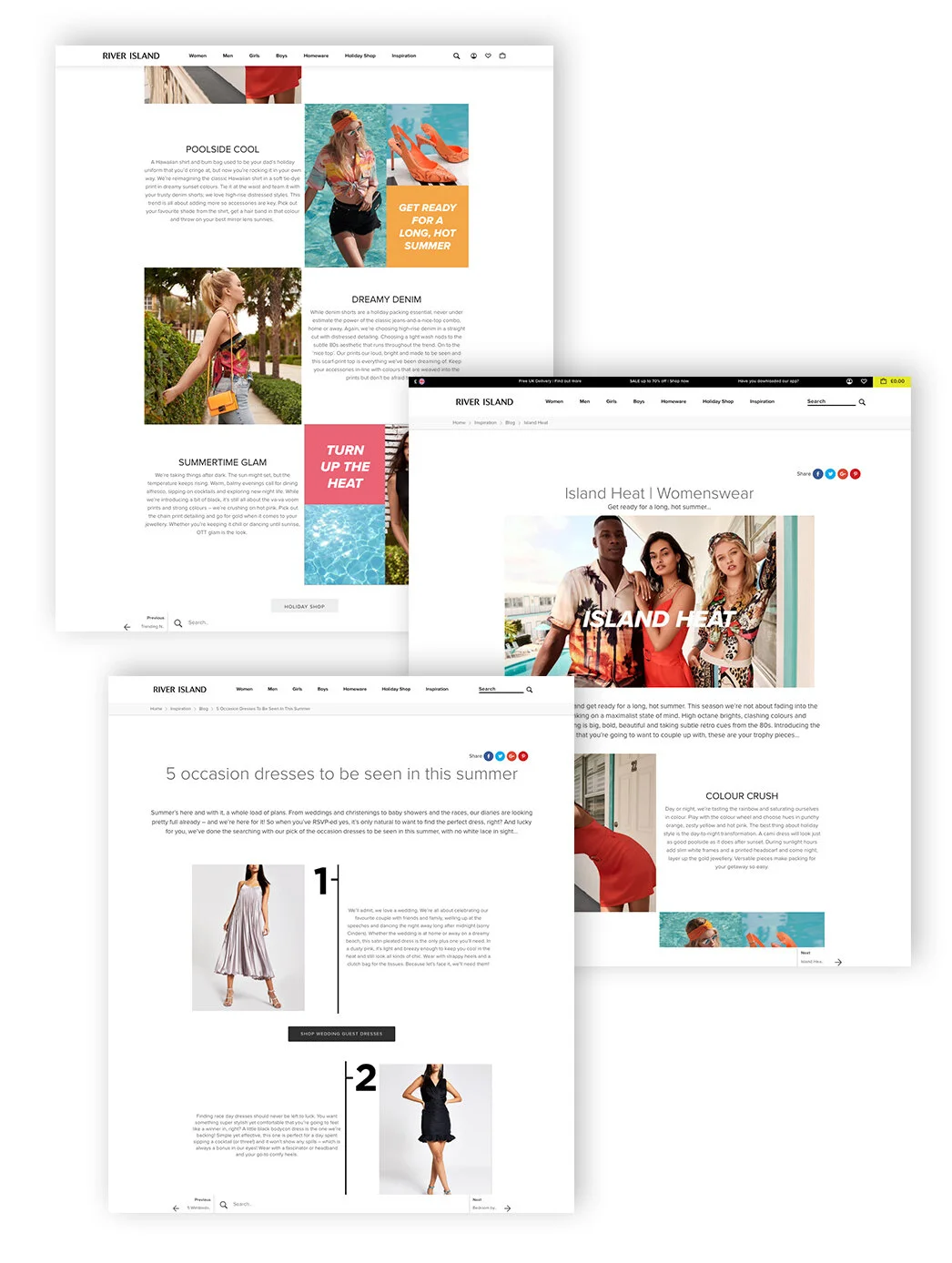
Mocking up the core screens
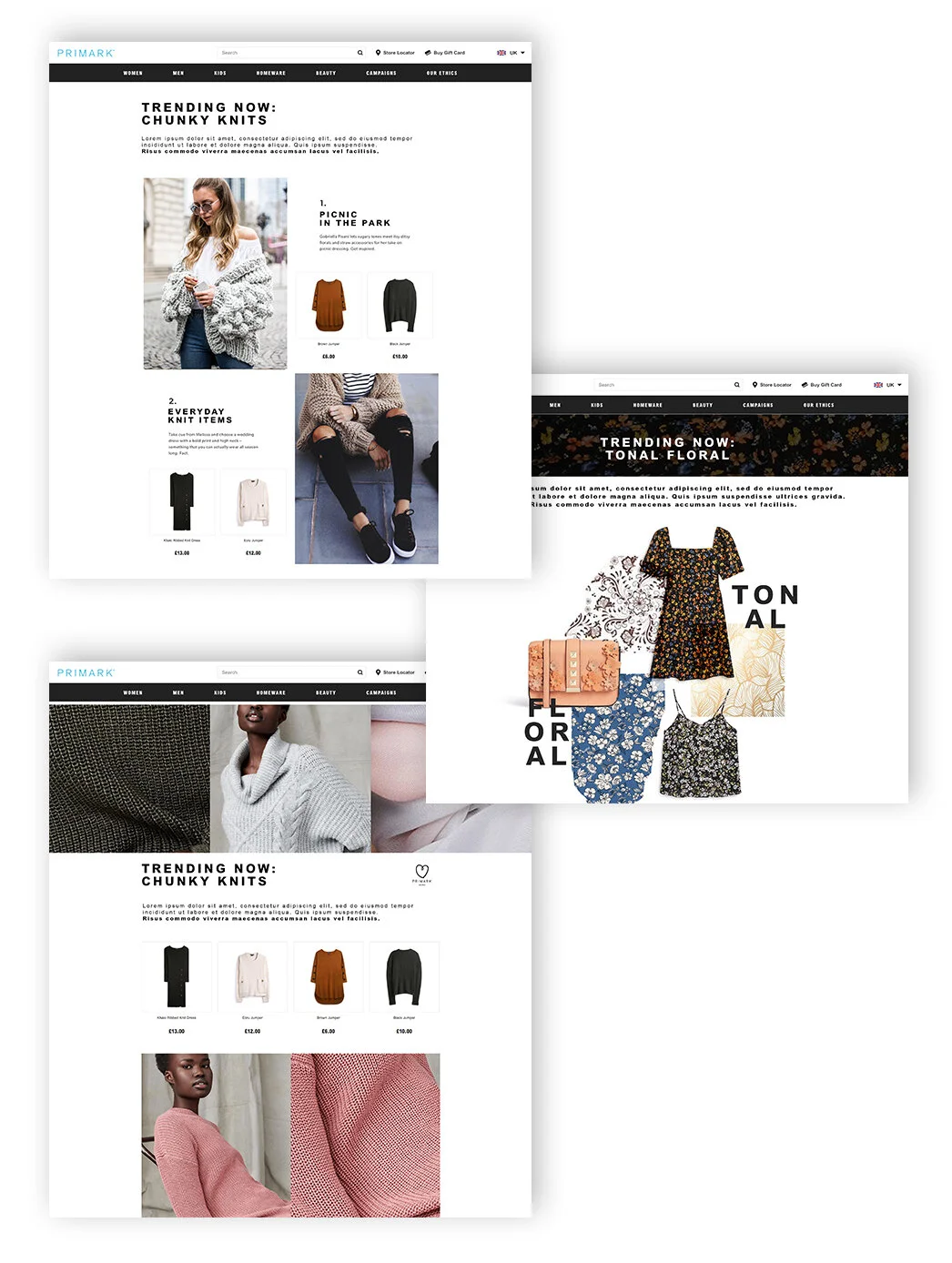
I created both low- and high-fidelity mock-ups and presented them to Primark stakeholders. Once the visual direction was agreed, I collaborated closely with developers and product designers at Amplience to bring the designs to life and ensure a smooth transition from concept to implementation.
Related pieces
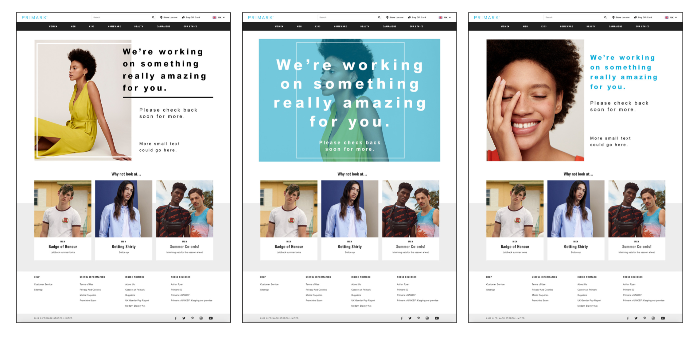
I designed the site’s maintenance pages alongside a new set of icons for use within the Store Locator.
The maintenance pages use fashion-led, macro, and positive imagery to maintain brand engagement and give users a preview of the inspiring content they can expect when the site is live.
The results
The wireframes and high-fidelity mock-ups were well received by the Primark team.
The work paid off, and the 2022/23 website refresh contributed to a c.60 % uplift in site traffic and 2x page engagement.
While future testing continued beyond my involvement, the work laid a strong foundation for further refinement and optimisation.